The Credibility Threshold: How Amateur Design Gets You Eliminated in 3 Seconds
The human brain judges your credibility in a split second, long before reading the first word. Neuroscience studies, like those by Gitte Lindgaard, have shown that it takes only 50 milliseconds to form an opinion on a document's visual appeal.
This first impression triggers a powerful psychological mechanism: the halo effect. The brain generalizes the perceived quality of your document to the quality of your entire company. A document that looks amateur suggests an amateur company, and therefore, an amateur solution. Your arguments might be brilliant, but if the packaging screams a lack of professionalism, you've already lost.
This initial negative signal taints the entire reading experience. Your prospect's brain has already labeled your offer as "inferior" and will subconsciously look for confirmation of that judgment.
Reaching that "professional threshold" isn't rocket science. It’s not about aiming for the Mount Everest of design, but simply about laying a solid foundation.
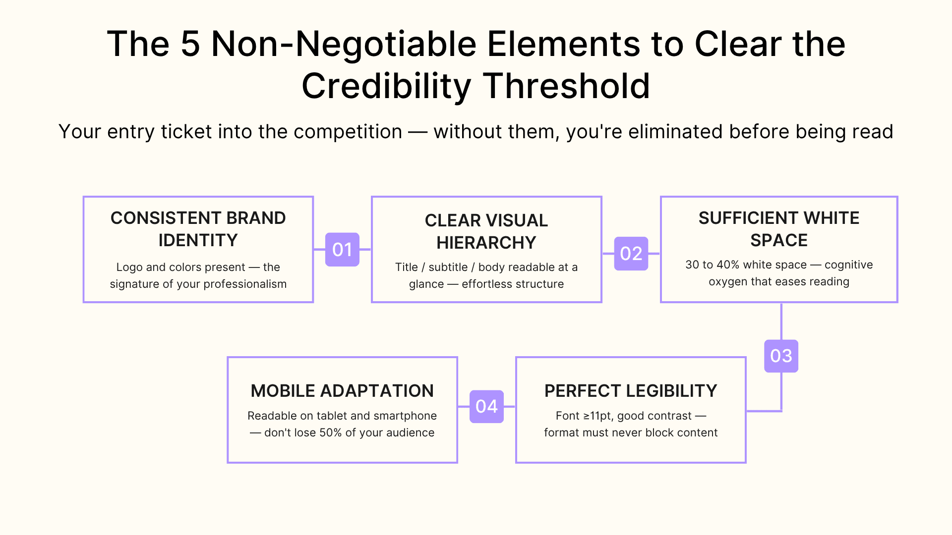
Here are the 5 non-negotiable elements to clear the credibility bar:
- Clear Brand Identity: Your logo and colors must be present and consistent throughout the document. This is the signature of your professionalism. A lack of visual identity is a symptom of a disorganized company.
- Clear Hierarchy: A reader must be able to distinguish a title, a subtitle, and body text at a glance. The brain needs to understand the information's structure effortlessly. If everything is on the same level, it's an indigestible mess.
- Enough White Space to Breathe: At least 30-40% of the page should remain empty. This white space isn't waste; it's "cognitive oxygen" that makes reading easier. A document that’s too dense exhausts attention in minutes.
- Perfect Readability: An 11-point font minimum and good contrast are essential. If a 55-year-old decision-maker has to squint to read your proposal, you've failed. The form should never be an obstacle to understanding the content.
- Mobile-Friendly Design: Nearly half of B2B decision-makers review proposals on a tablet or mobile phone. A document that's unreadable on an iPad is a deal lost on the train. Think "responsive" or lose half your audience.
These five points are your ticket to the game. They don't guarantee a win, but they give you the right to compete on a level playing field.
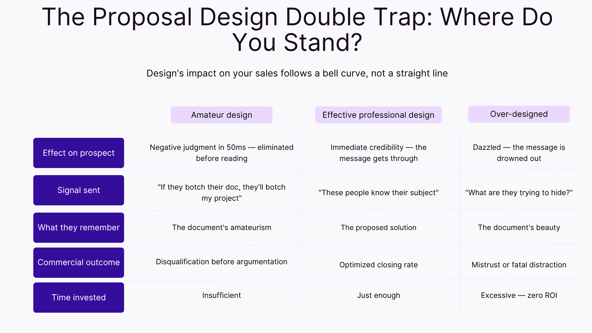
The "Too-Good-Looking" Trap: When Design Eclipses Your Message
Excessive design is a more subtle but equally fatal mistake. It drowns your message and can even breed mistrust.
Failure Case #1: The Conservative Client's Mistrust. Imagine a consulting firm responding to an RFP for a restructuring project at a major law firm. They submit a visually spectacular proposal. The partners' reaction? "If they're spending this much time impressing us with the form, they're probably compensating for weaknesses in the substance.". It’s the "all style, no substance" effect: a package that’s too perfect to be trusted. The deal was lost to a competitor with a more sober, fact-based offer. The lesson: your client's context dictates the acceptable level of creativity.
Failure Case #2: The Wasted Sales Time. A senior salesperson spends four hours tweaking the pixel alignment on their proposal. The ROI of this perfectionism is zero. The closing rate of a "perfect" proposal is identical to that of a "simply professional" one. This is the law of diminishing returns: beyond the professional threshold, every hour invested in design is an hour of prospecting lost.
The golden rule is simple: if they remember your design but not your solution, you have failed.
Think of a Michelin-starred restaurant. You remember the dish, its flavors, its mastery. You don't remember the plate. The plate is there to highlight the dish, to make it easier to enjoy, but it should never become the topic of conversation. Your design is the plate. Your solution is the dish.
Cuevr automatically generates a professional design from your content
No design skills required. Set up your brand once (logo, colors), write directly in the builder, and Cuevr automatically produces a professional layout. A design built for conversion, not just for looks.
- Automatic design generation based on your brand settings
- Layout optimized to guide attention toward key conversion elements
- Professional rendering without spending hours in PowerPoint
Effective Aesthetics: The 3 Principles of Design That Serves Closing
- Hierarchy: Guide the Eye to What Matters. Good design directs attention. The elements you need to highlight visually aren't your services or references, but what triggers the decision: the client's quantified stakes, the concrete benefits of your solution, and the demonstrated ROI. A simple hierarchy (Title > Subtitle > Body) is enough to guide the reading path and make your argument crystal clear.
- Readability: Let the Content Breathe to Be Understood. White space is oxygen for the brain. Research has shown that proper use of margins and line spacing can improve reading comprehension by 20%. Use short paragraphs (4-5 lines max), bullet points, and an airy layout. An uncluttered document isn't an empty one; it's a document that respects your prospect's limited attention.
- Responsiveness: Don't Lose the 50% of On-the-Go Readers. Today, a proposal that isn’t perfectly legible on a tablet or smartphone is an anomaly. Sending a static PDF means risking that your document will be unreadable and immediately closed by the director viewing it on the train. The modern solution is to use web-native, adaptive formats that guarantee an optimal reading experience on any screen. Failing to do so is willingly cutting your market in half.
The Real Solution: Separate Substance from Form to Unleash Performance
The conclusion is undeniable: a senior salesperson spending hours battling PowerPoint is economic nonsense. Their expertise is in sales, not in graphic design. This precious time, wasted aligning text boxes, has an immense opportunity cost.
The strategic question for any sales leadership is this: how can you guarantee a consistently professional design without distracting salespeople from their primary mission?.
Fundamentally, there are only two coherent paths.
The first is the luxury route: building a pre-sales team of graphic designers. For each strategic proposal, a designer takes the salesperson's raw content and creates a custom layout. This approach can yield exceptional results, but its cost is prohibitive and it is absolutely not scalable for most companies.
The second, more modern and agile path is to equip your team with tools that automate the formatting of the content produced by the salesperson. The intelligence lies in separating tasks: the seller focuses 100% on the substance, and technology handles the presentation. These tools are rare, but Cuevr is precisely one of them.
This approach is in radical opposition to the most common method used today, which is a true source of inefficiency: the infamous "templates" or "master slides" provided by marketing. This system consistently creates two losing scenarios:
- The Rigid Cage: The salesperson is instructed not to touch anything to avoid "breaking" the design. They end up sending proposals that are certainly pretty, but soulless and lacking substance, as customization is nearly impossible. The closing rate plummets.
- The "Frankenstein": The salesperson, aware of the need for personalization, tries to modify the template. They spend a huge amount of time on it, inevitably destroy the visual consistency, and end up with a clunky, hybrid document that damages the company's image.
The right solution delivers the best of both worlds. It relies on a workflow designed for the salesperson, not against them. First, the seller works in a builder focused exclusively on content. Using smart "wireframes," they are guided to structure their argument: what information to include, at what point, for maximum impact. They concentrate on the strategy of their message.
Then, once the substance is finalized, with a single click, the platform applies the company's brand guidelines: the right logo, the right colors, the right typography. The entire proposal is instantly generated in a perfectly responsive viewer, ensuring an optimal reading experience on a desktop or a mobile device.
The result is a proposal that is ultra-personalized in substance and perfectly professional and consistent in form. You industrialize excellence without ever sacrificing client-specific adaptation. You free up your sales teams from a low-value chore so they can finally dedicate 100% of their time to their real mission: selling.
Your proposal looks perfect on every device
Your prospects review proposals on mobile, tablet, and desktop. Cuevr’s viewer ensures an optimal reading experience on any device, with smooth navigation between sections.
- Automatic adaptive display based on your prospect’s device
- Intuitive navigation between sections on all platforms
- Professional reading experience that reinforces your credibility
Frequently Asked Questions
My competitor sends ultra-designed proposals with animations. Should I do the same?
No. In B2B, professional sobriety beats aesthetic originality 9 times out of 10. A grandiose design either distracts from the business message or generates mistrust. Your goal is to meet the professional threshold without distracting from your value. Prospects remember solutions that solve their problems, not pretty presentations.
What are the 5 minimum visual elements to avoid looking like an amateur?
The professional threshold: (1) Consistent logo and brand identity, (2) 3-level typographic hierarchy, (3) 30-40% white space, (4) Guaranteed readability (≥11pt font, good contrast), (5) Responsive for mobile/tablet. Master these 5 points and you will clear the credibility bar.
How can we improve our design without hiring a graphic designer or training the team?
Automation is the only scalable solution. A system that separates substance (the salesperson's job) from form (technology's job). The salesperson builds the structured content, and the platform automatically generates the professional design. The result: sales time is reclaimed for high-value activities + brand consistency is guaranteed.