Here is the library of advanced blocks.
These are blocks built by Cuevr experts to simplify the work of building sales proposals.
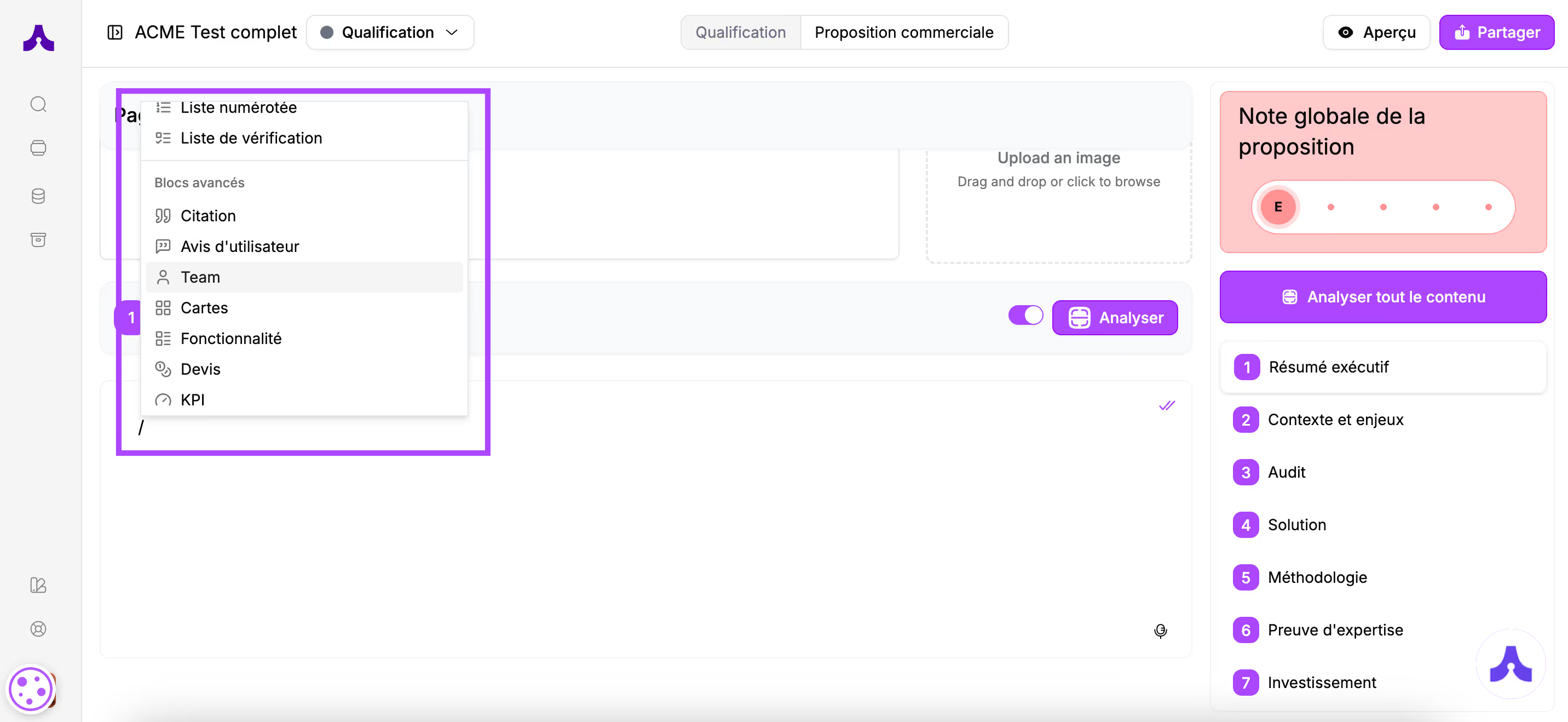
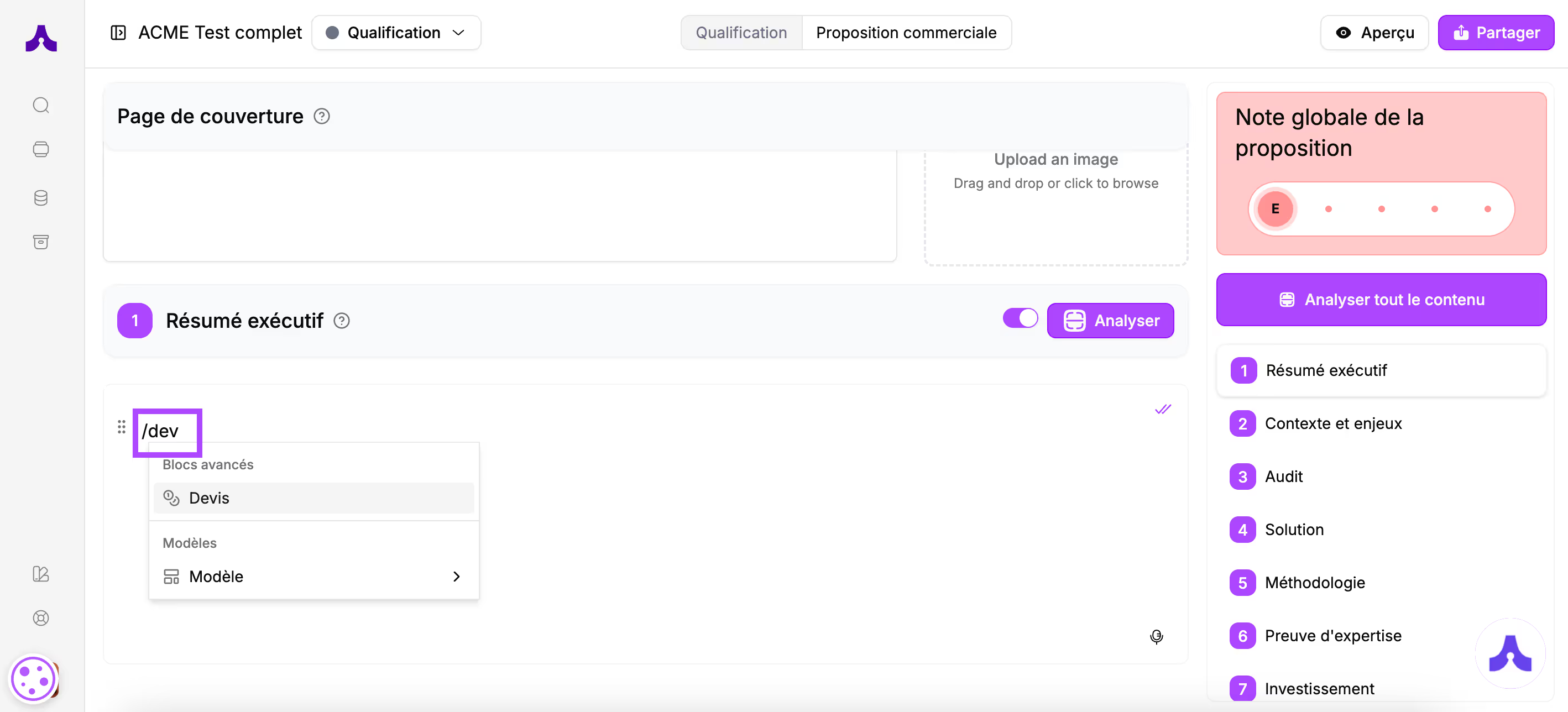
As a reminder, you can choose the blocks in your proposal builder space by typing "/" in the section you are working on.
Citation
Use case
- Expert quotes to reinforce credibility
- Client testimonials in the "Proof of expertise" section
- Verbatims from satisfied clients in the "Solution" section
- Prospect verbatims from your discussions in the "Context and challenges" section
Block construction
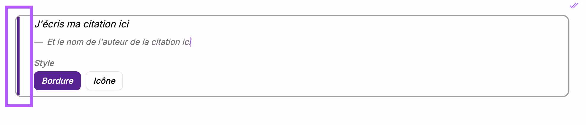
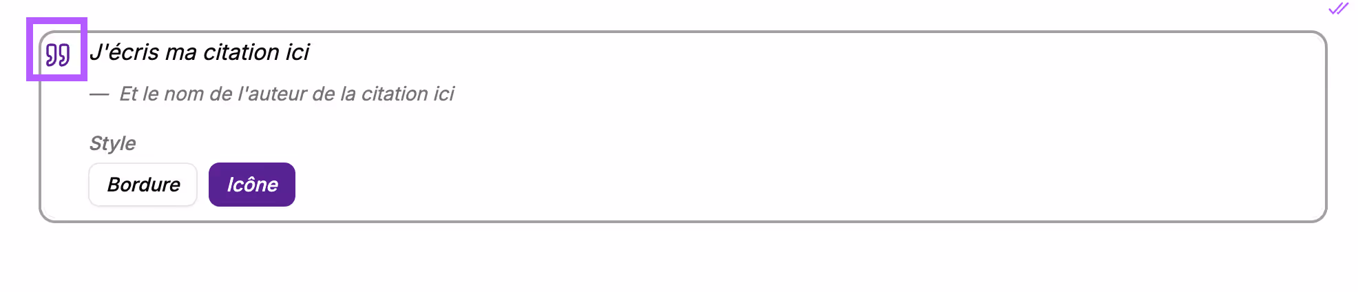
It will appear in your section like this:
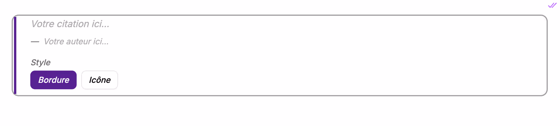
You can now add the quote in the designated space, as well as the author of the quote.
You have 2 formatting options available:
- Border: a vertical line in your primary color
- Icon: the quote is preceded by a "quotation mark" icon
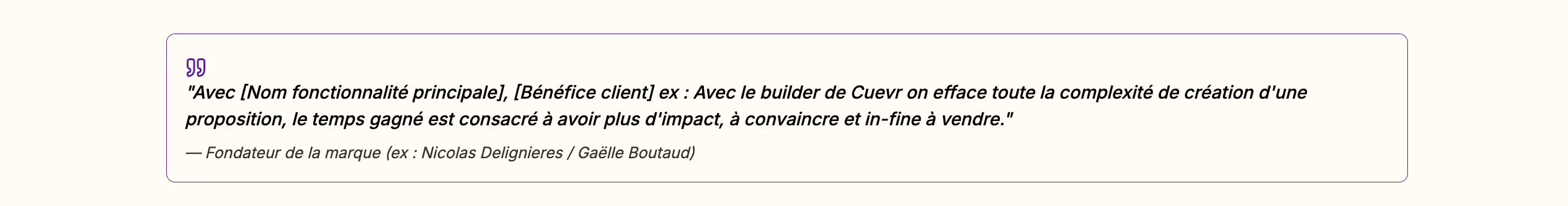
Block preview
In the final proposal, this block will appear like this:


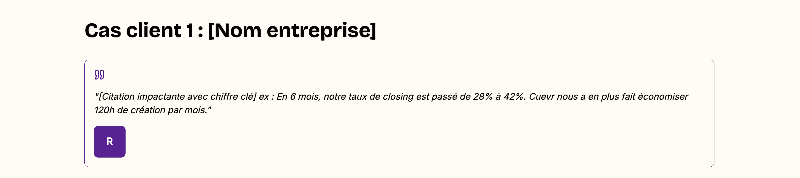
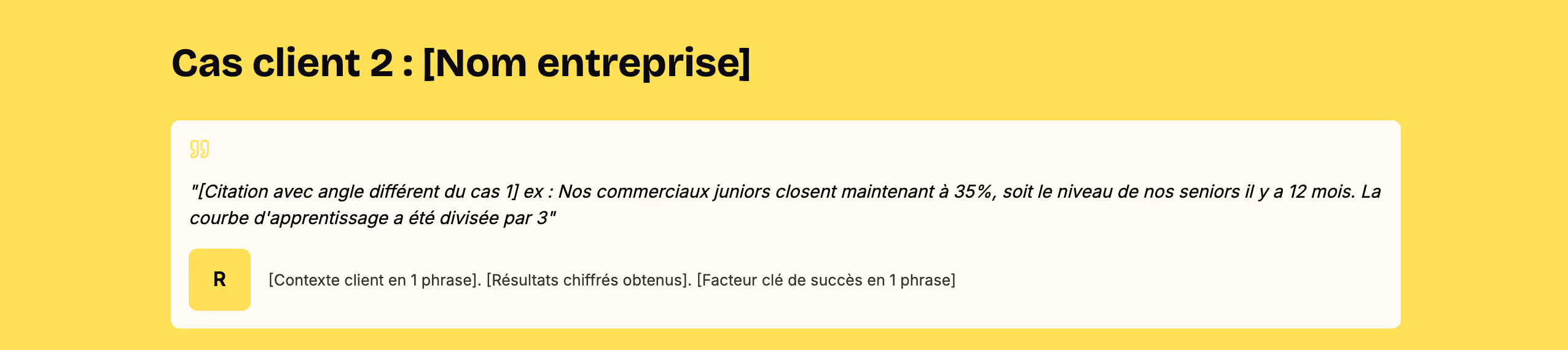
User review
Use case
- Detailed testimonials with user or client photos in the "Proof of expertise" section
- Client case studies
Block construction
It will appear in your section like this:
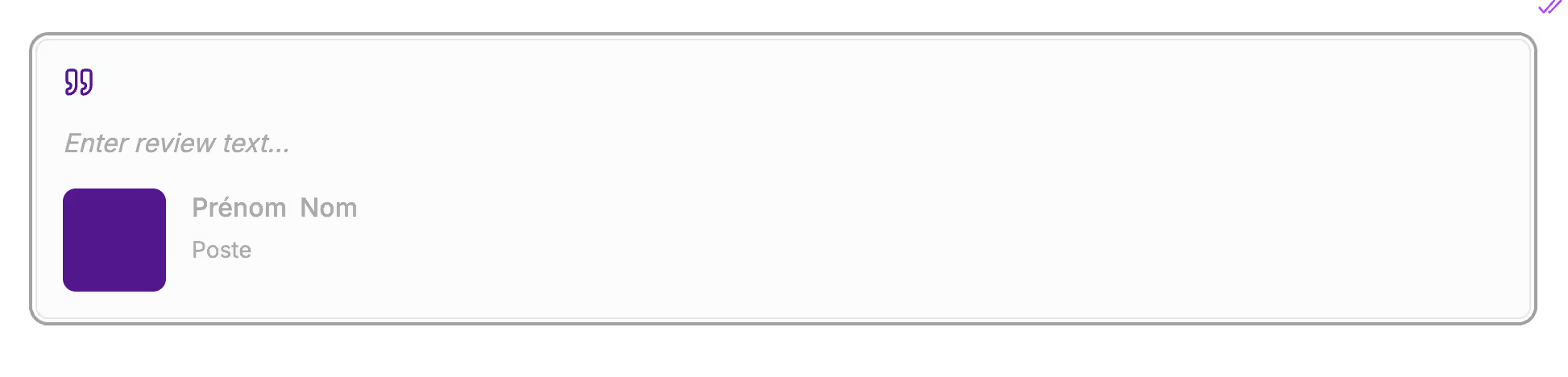
Enter:
- The user's review in the line below the quotation marks
- The name, first name, and job title of the cited user in the fields provided.
You have the option to add a photo. If you don't upload one, the user's initials will be displayed.
Block preview
In the final proposal, this block will appear like this:
Team
Use case
- Presentation of project stakeholders in the "Methodology" section
- Reassure the prospect in the "About" section by putting faces to the project team
Block construction
It will appear in your section like this:
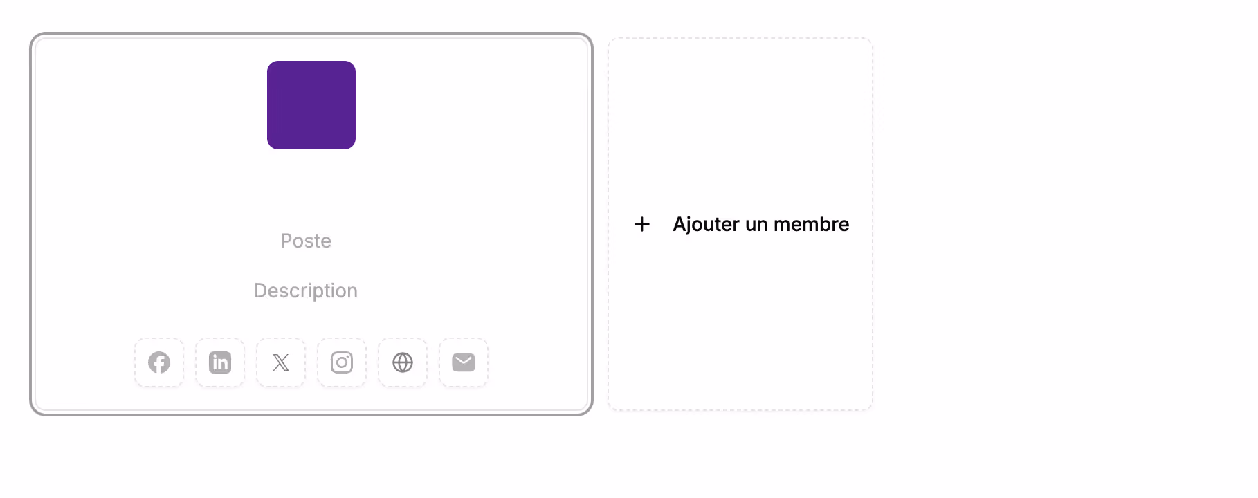
In this block, you can:
- Upload your photo (by default, initials will appear once you've entered the name)
- Enter your name
- Fill in your job title
- Add a description or your phone number
You can also add links to:
- A Facebook profile
- A LinkedIn profile
- An X (Twitter) profile
- An Instagram profile
- The company website
- Your email
Fields left blank will not appear in the final proposal.
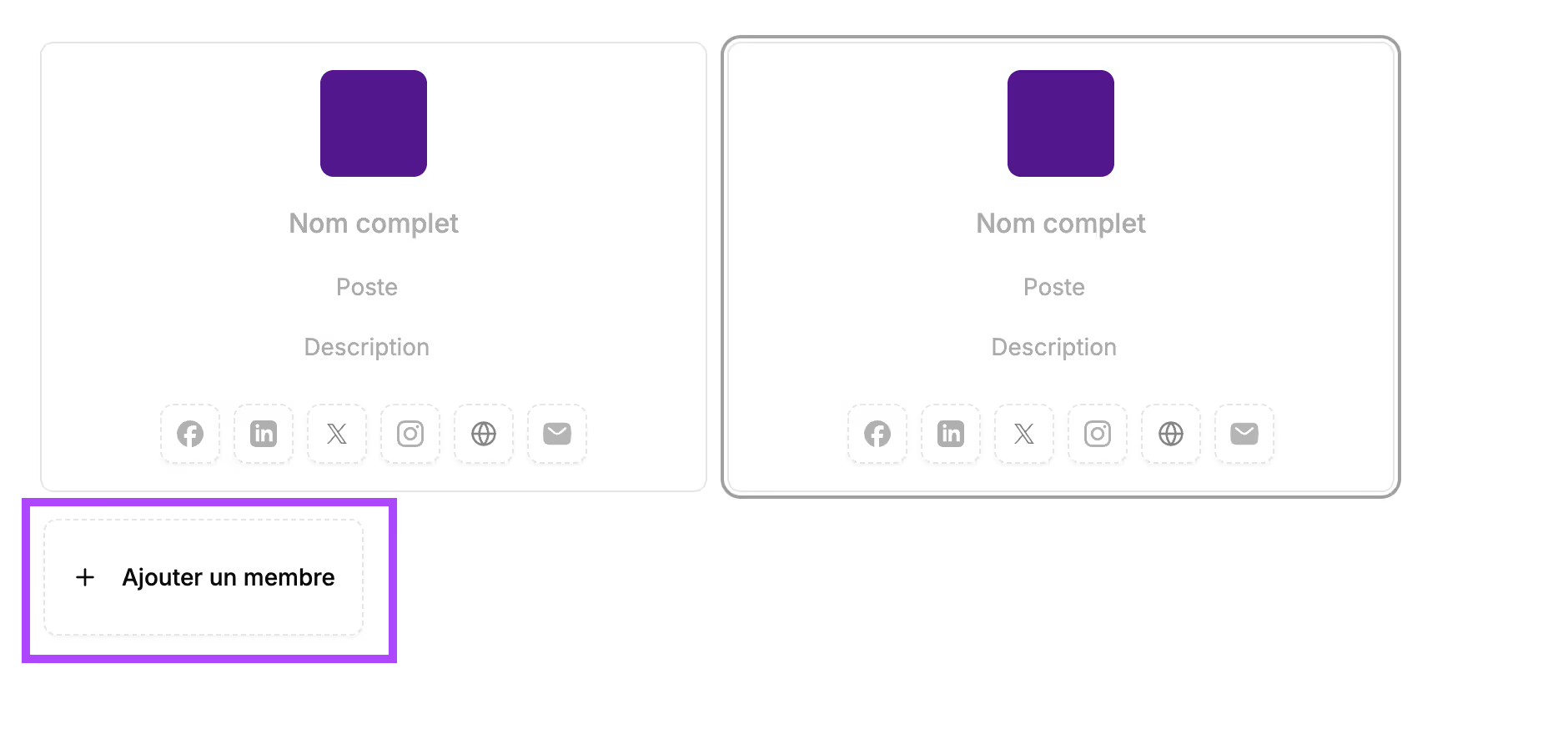
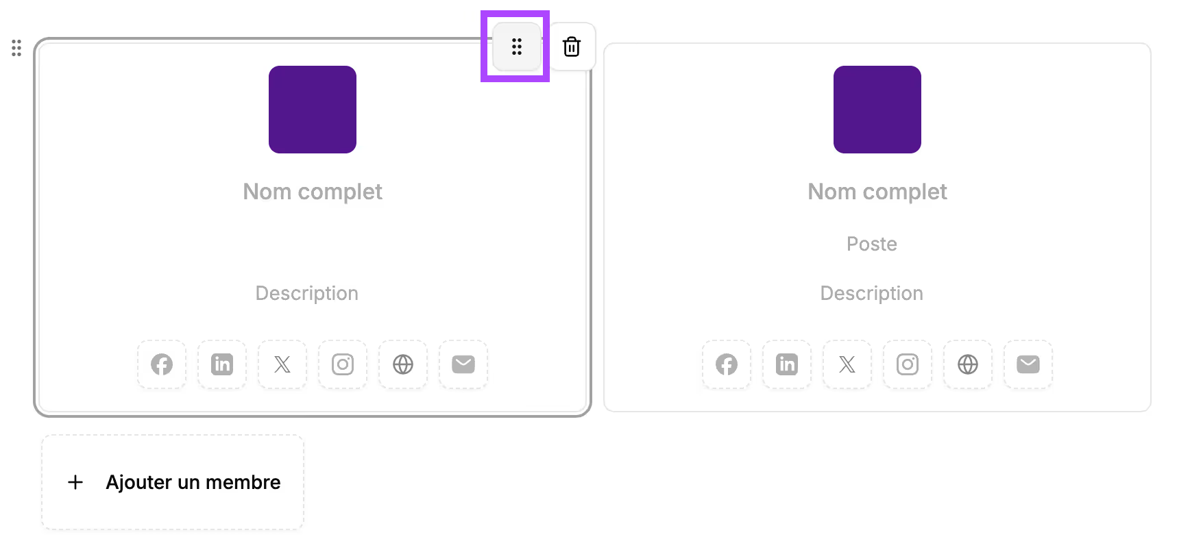
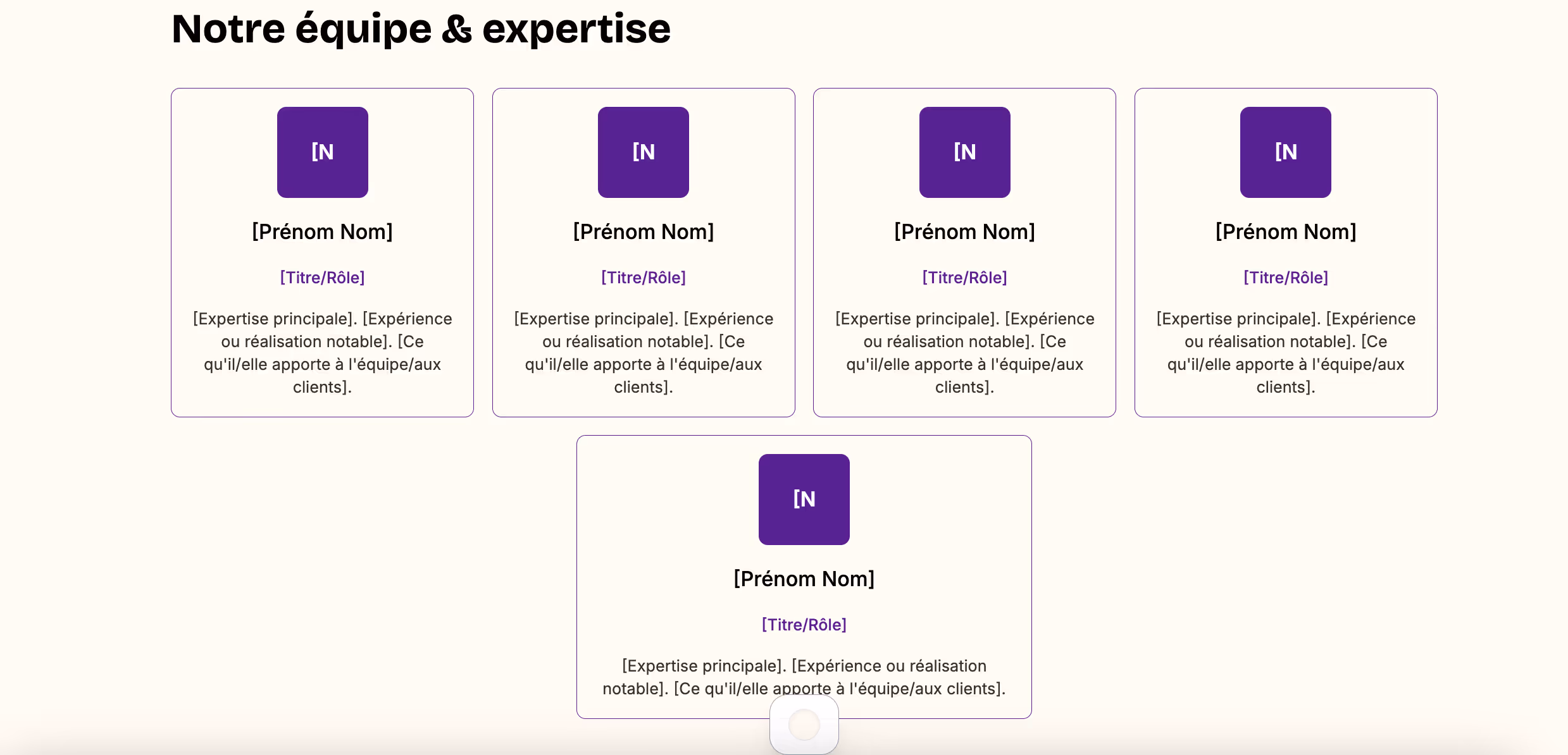
Cuevr automatically manages the placement of the cards and will align 4 members on the same line.
You can still change the order of the team members by clicking the "6 dots" icon at the top right of the card and dragging the card to the desired location.
Block preview
In the final proposal, this block will appear like this:

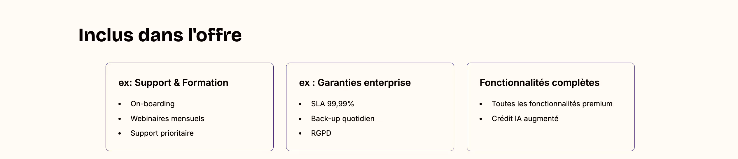
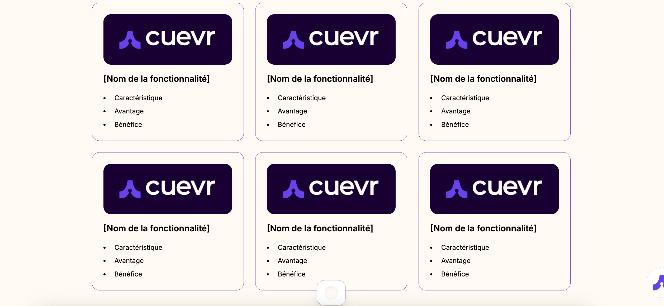
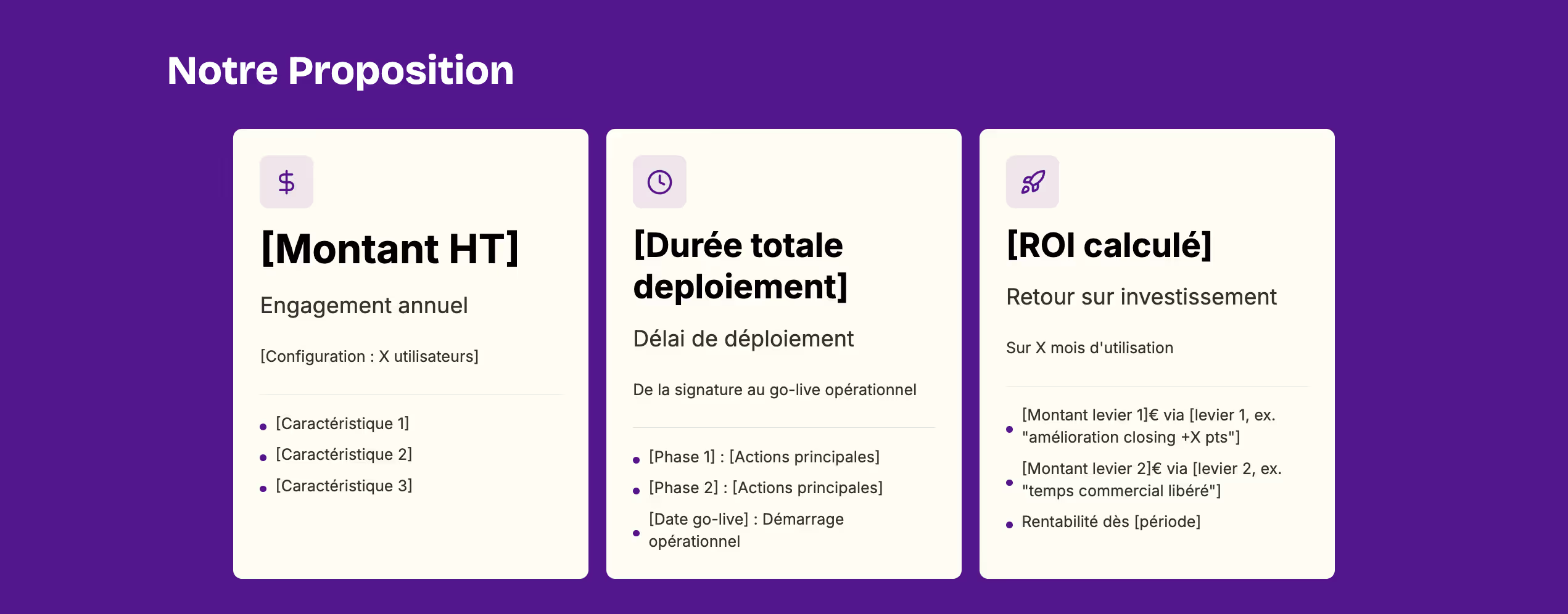
Cards
Use case
The use cases for cards are numerous. The big advantage of this block is that it allows you to add a visual to the card (unlike the KPI block, which highlights a key figure or a short title).
Possible use cases include:
- Presentation of services/offers in the "Solution" section
- Detail of deliverables by phase
- List of product features
- Presentation of different subscription plans (if the "Pricing offers" block doesn't suit you)
- In the "Solution" section: to detail additional features, key arguments, a difference from competitors
- In the "Investment" section to detail what is included in the offer
- In the "ROI" section to highlight 2 or 3 ROI levers
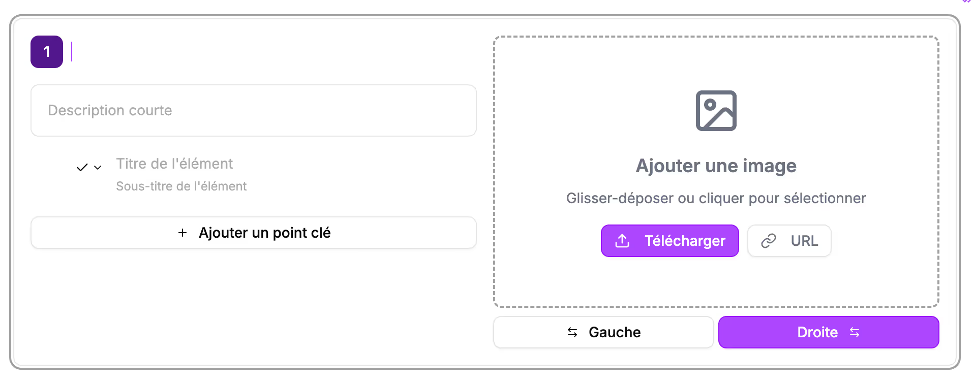
Block construction
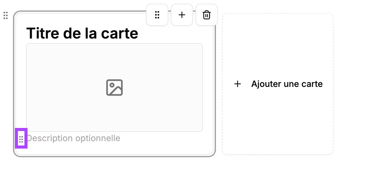
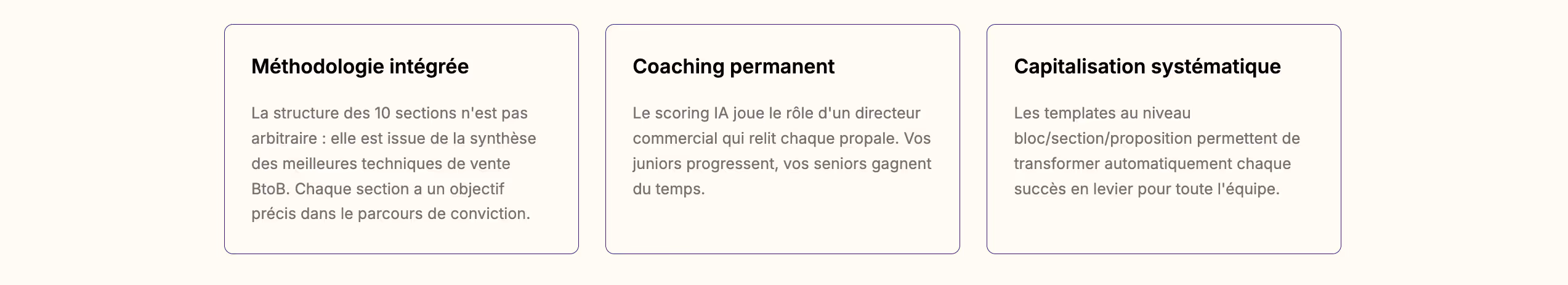
It will appear in your section like this:
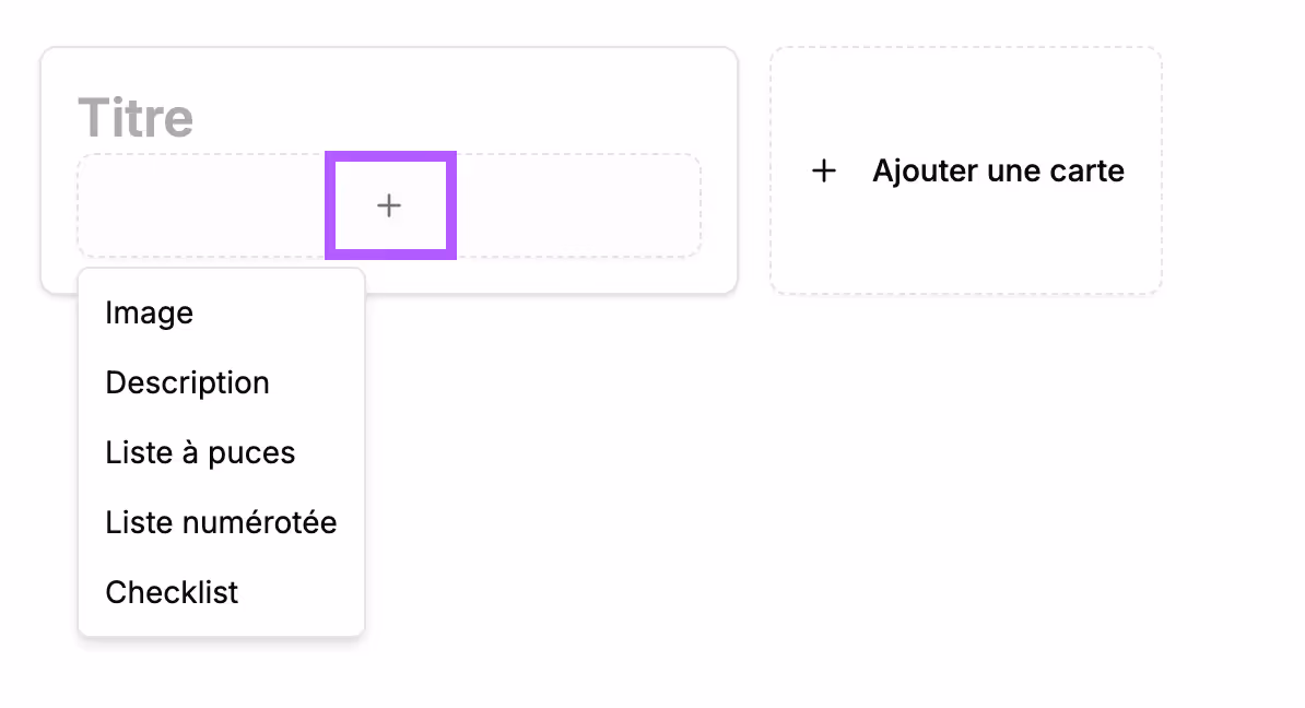
In the cards, you will first put the title of the card. Then click the + to add an image, a description, a bullet list, a numbered list, or a checklist
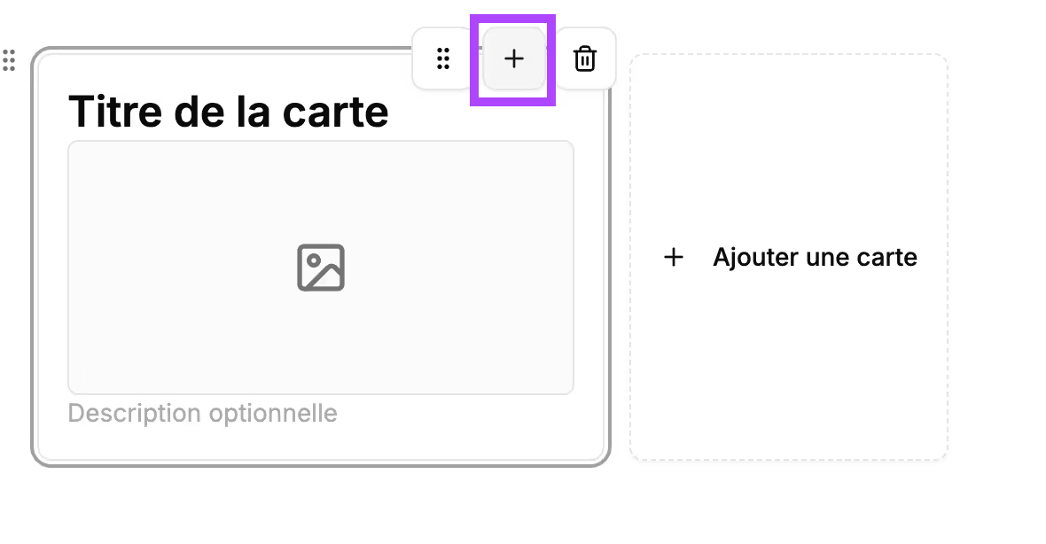
You can change the order of elements within the card by clicking the 6 dots to the left of the element and dragging it to the desired position.
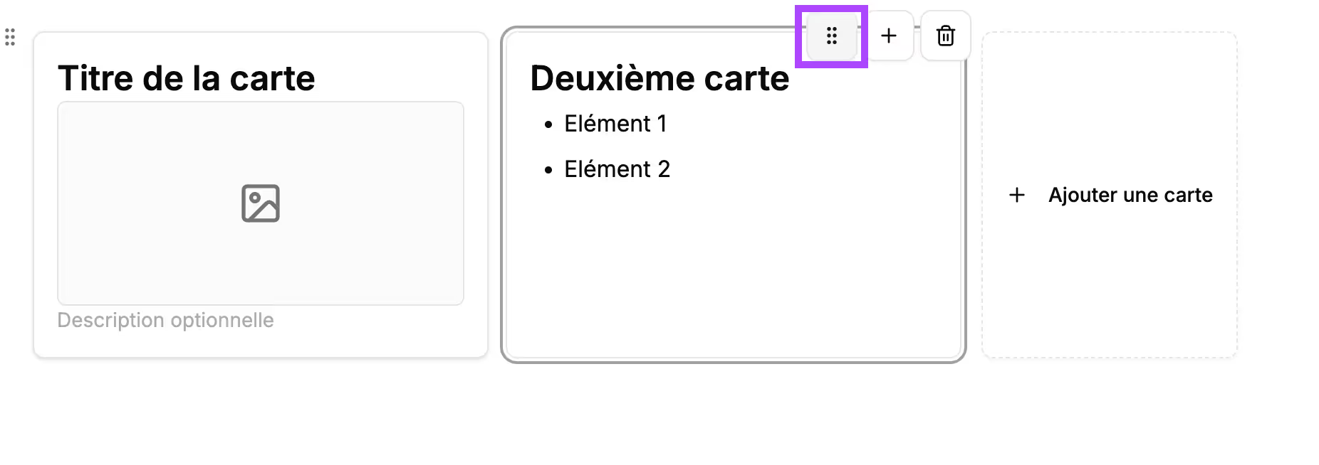
You can also change the display order of the cards by clicking the 6 dots on the card and dragging it.
The position of the cards is automatically managed by Cuevr.
Depending on the spacing you chose in your brand and identity settings, 2 or 3 cards will display on the same line.
Block preview
In the final proposal, this block will appear like this:
Feature
Use case
- Detail of product features
- Technical presentation of the offer
- Explanation of the proposed modules/services
Block construction
It will appear in your section like this :
To fill this block, instructions are present on the block:
- Title: enter the name of the feature described here
- Short description: present the feature, its role
- Key point: enter the title of the key point you want to highlight for this feature and, if you wish, a description. You can add multiple key points
- Image: upload an image, a screenshot representing the feature
You have formatting options available for this block:
→ 1: by default, you have a "1" displayed at the top left of the block. You can change the character, especially if several feature blocks follow one another. To do this, click on the 1 (a cursor appears), delete the 1, and type the new character.
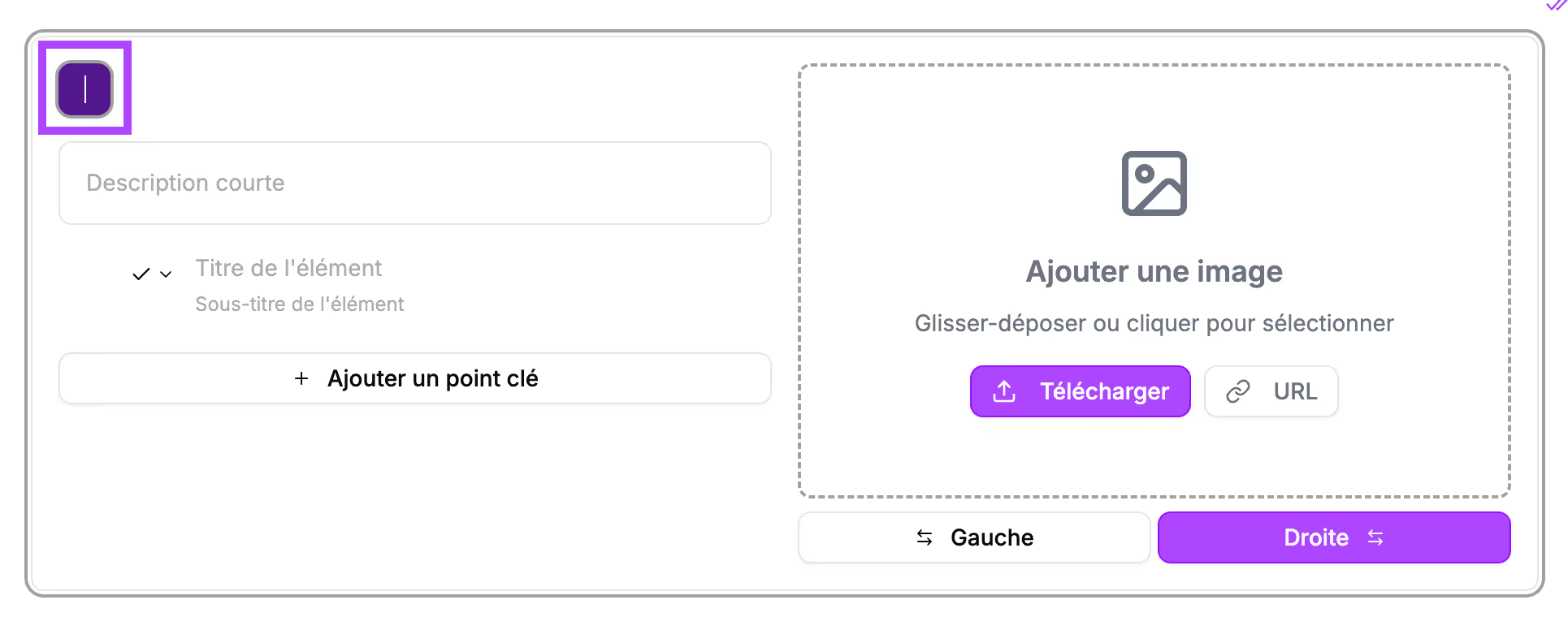
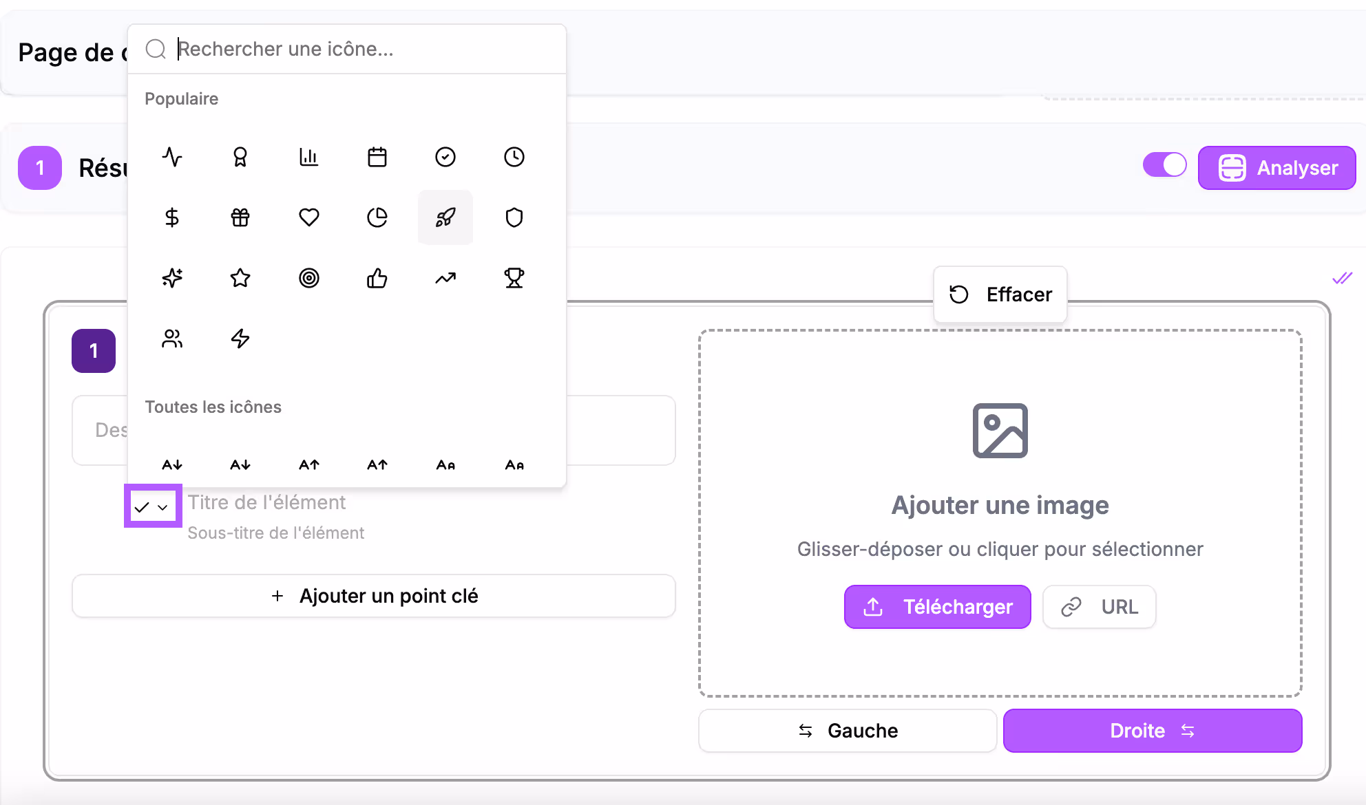
→ The icon to the left of the key points: click the small arrow to the right of the icon and choose the icon you want to display from the list
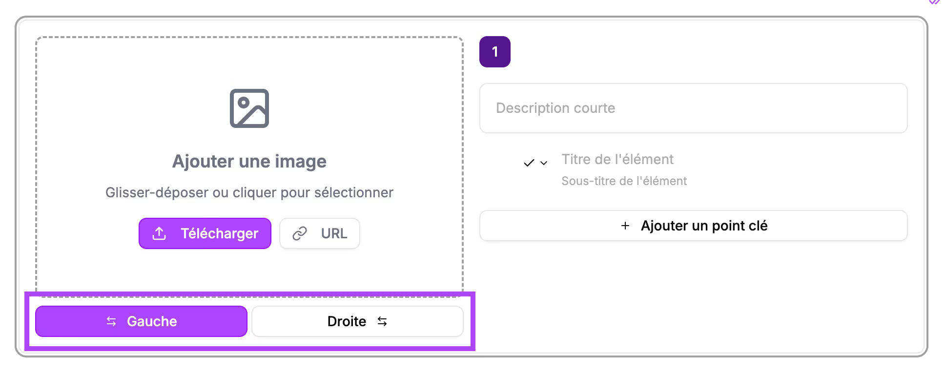
→ The position of the image: you can reverse the positioning of the text and the image. Click the "left" button under the image
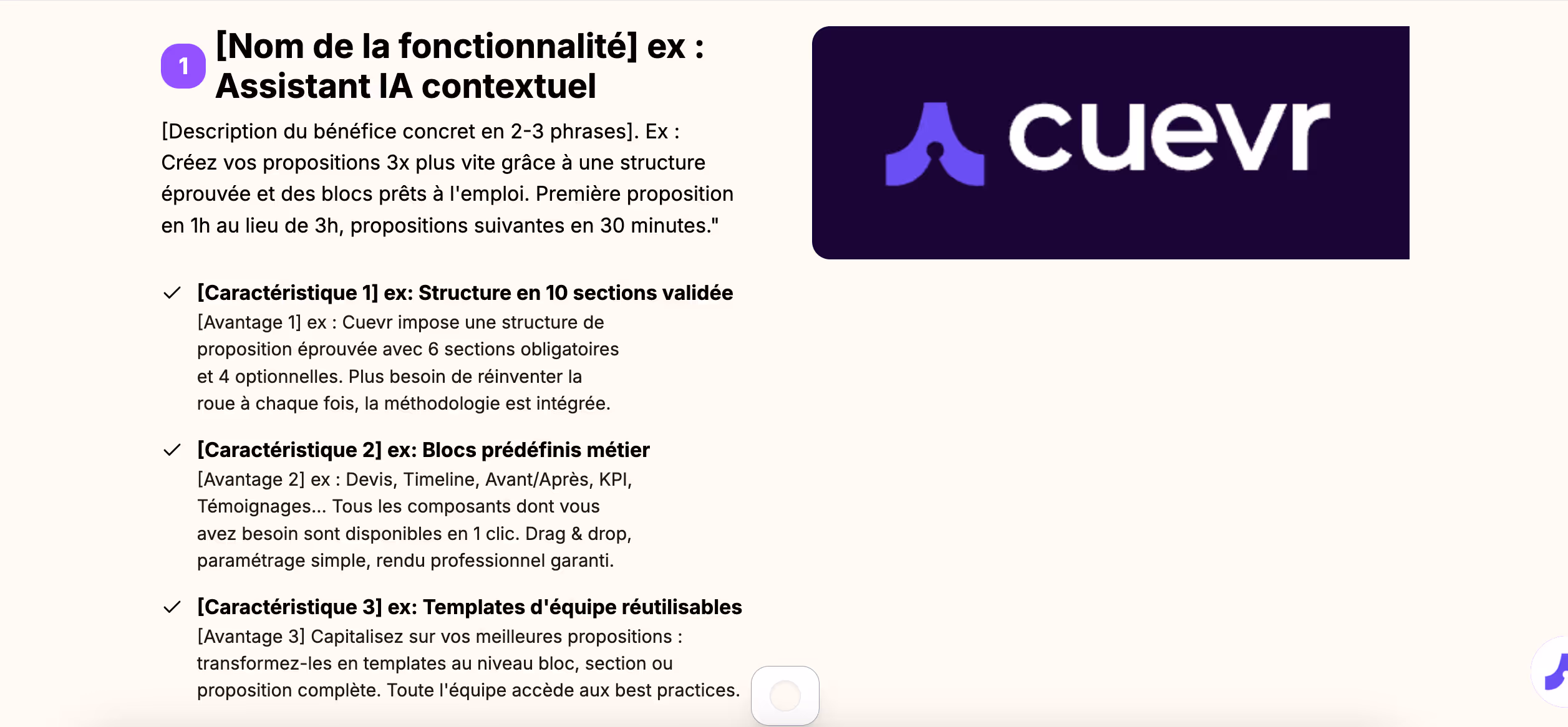
Block preview
In the final proposal, this block will appear like this:
Quote
Use case
- In the "Investment" section for a structured presentation of pricing
- Detail of services with subtotals
- Proposals with options using sections and labels
Block construction
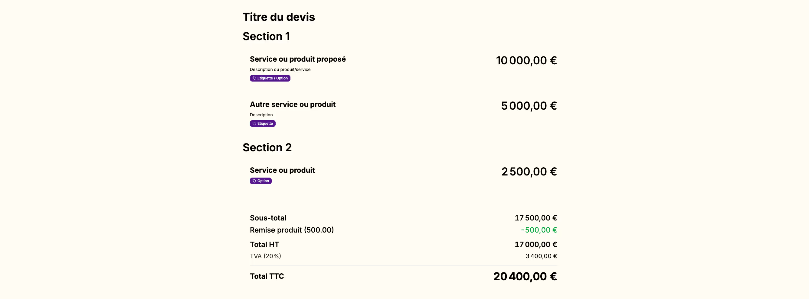
It will appear in your section like this :
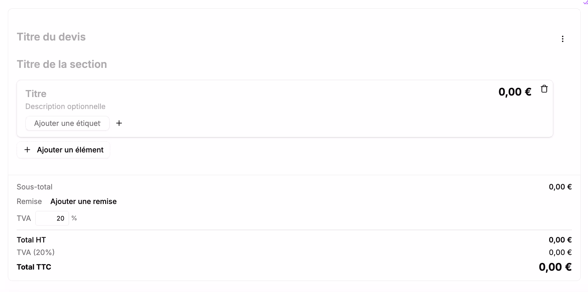
You can add a title to your quote.
If you do not enter a title, the preview will act as if the field does not exist.
By default, only one section appears.
If you don't need to add multiple sections, do not fill in this field; the preview will adjust automatically.
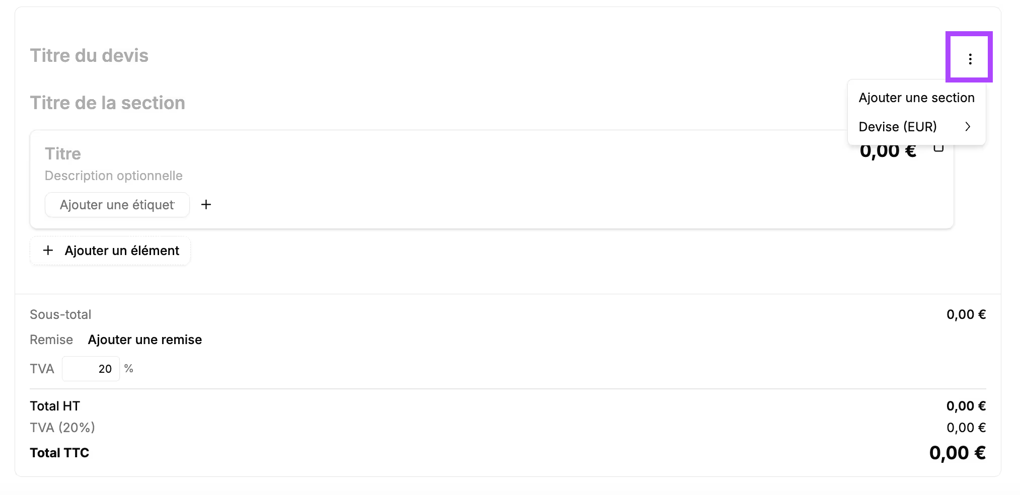
To add a section, click the 3 dots at the top right and "add a section".
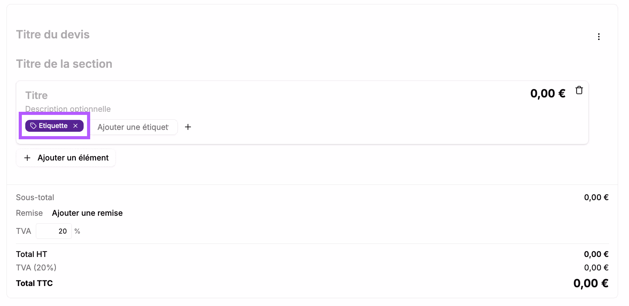
In the box, fill in the information related to the service: the title and optionally the description. You can add multiple service lines by clicking the "+ add an item" button.
It is possible to create labels to highlight a tag.
Indicate the amount of the service in each box.
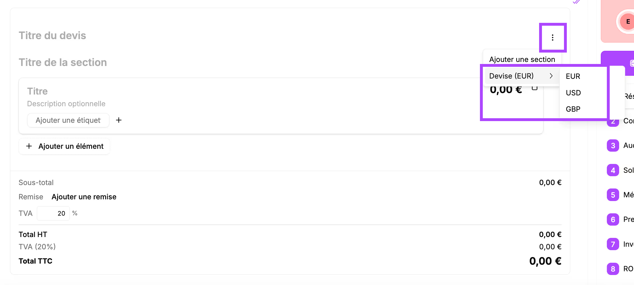
The currency is managed automatically.
By default, prices are displayed in euros.
To change the currency, click the 3 dots at the top right, then on "Currency" and choose the desired currency.
The subtotal is calculated automatically.In this part, you have the option to add a discount.
Click "Add a discount”
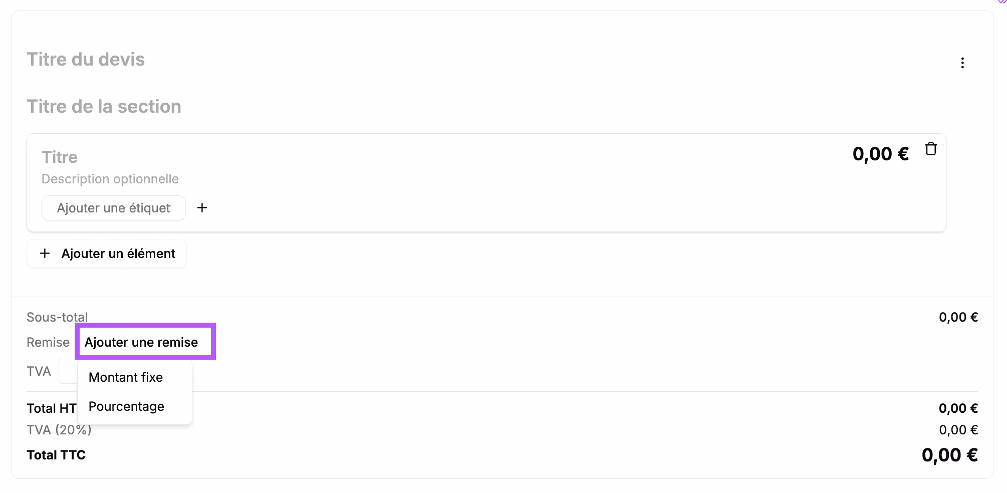
The discount can be a fixed amount or a percentage:
→ Fixed amount: you can enter the name of the discount and the amount.
→ Percentage: you can enter the name of the discount and the percentage. The discount is applied directly to the total price.
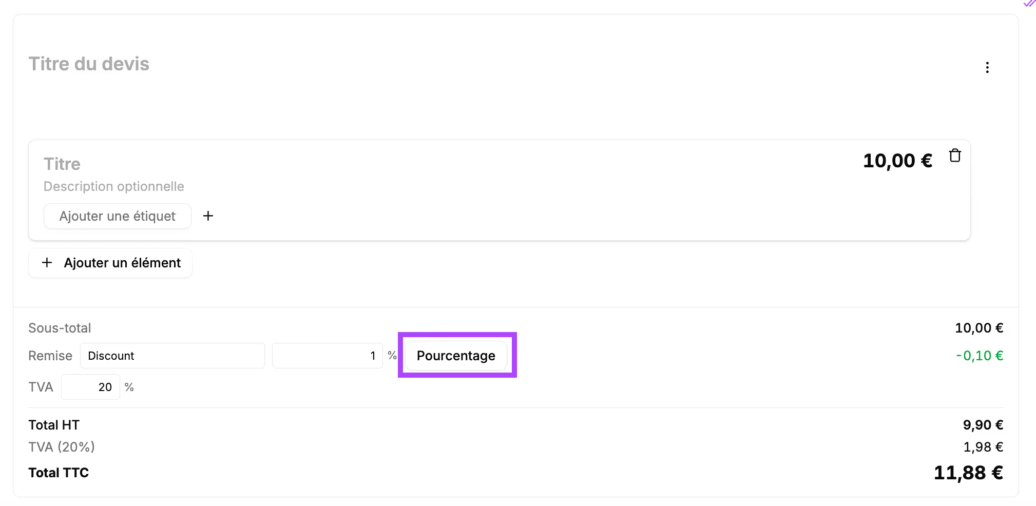
Click the "Fixed amount" or "Percentage" button and change the discount type. It is also possible to remove the reduction using this button.
The VAT is set to 20% by default. The VAT % can be changed if needed.
Block preview
In the final proposal, this block will appear like this:
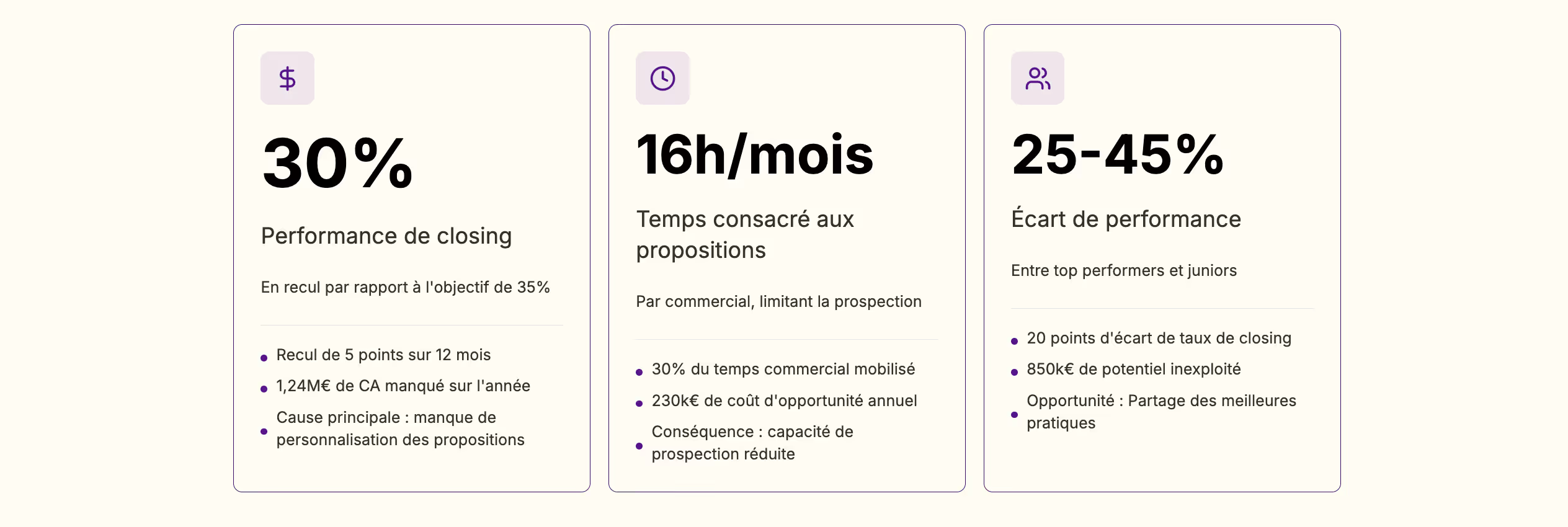
KPI
Use case
- In the "Executive summary" to highlight key points of the proposal or key figures
- In the "Context" section: market figures, quantified problem, identified stakes
- In the "ROI" section to highlight the expected, quantified results
Block construction
It will appear in your section like this:
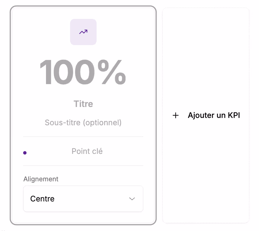
Several elements need to be filled in:
- The "100%" field: Indicate the key figure (%, h/month, €) or the keyword you want to highlight.
- The "Title" and "Subtitle" fields: allow you to provide details about the highlighted element
- The key points: these are associated characteristics, details of steps, detail of an amount... (they are not mandatory; they will not appear in the final proposal if you do not fill these fields)
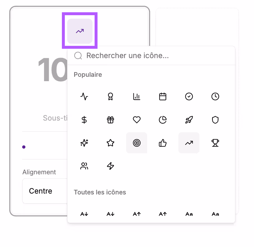
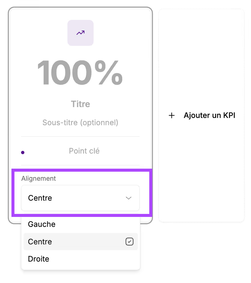
You also have formatting options:
→ The icon can be changed by clicking on it and selecting the desired icon
→ You can choose the alignment of the elements in the card:
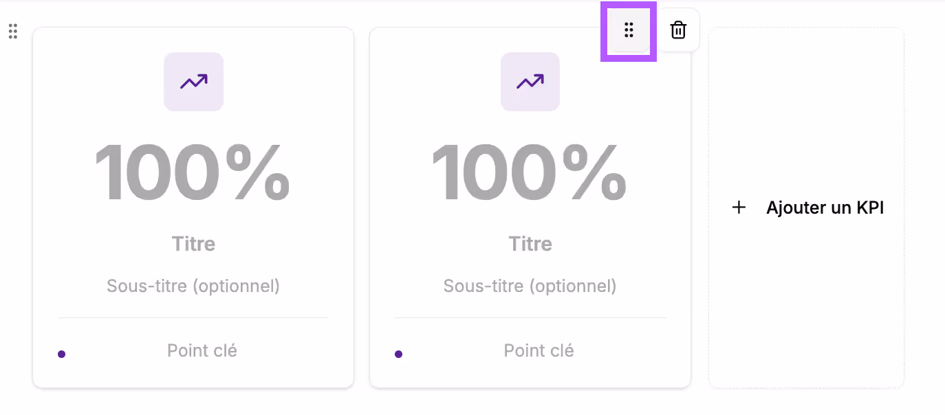
You can add multiple KPI cards by clicking "+ Add a KPI".
Cuevr manages the placement of the cards. Up to 3 cards are displayed on the same line.
It is possible to change the order of the KPI cards by clicking the 6 dots at the top right of the card and dragging it to the desired location.
Block preview
In the final proposal, this block will appear like this:
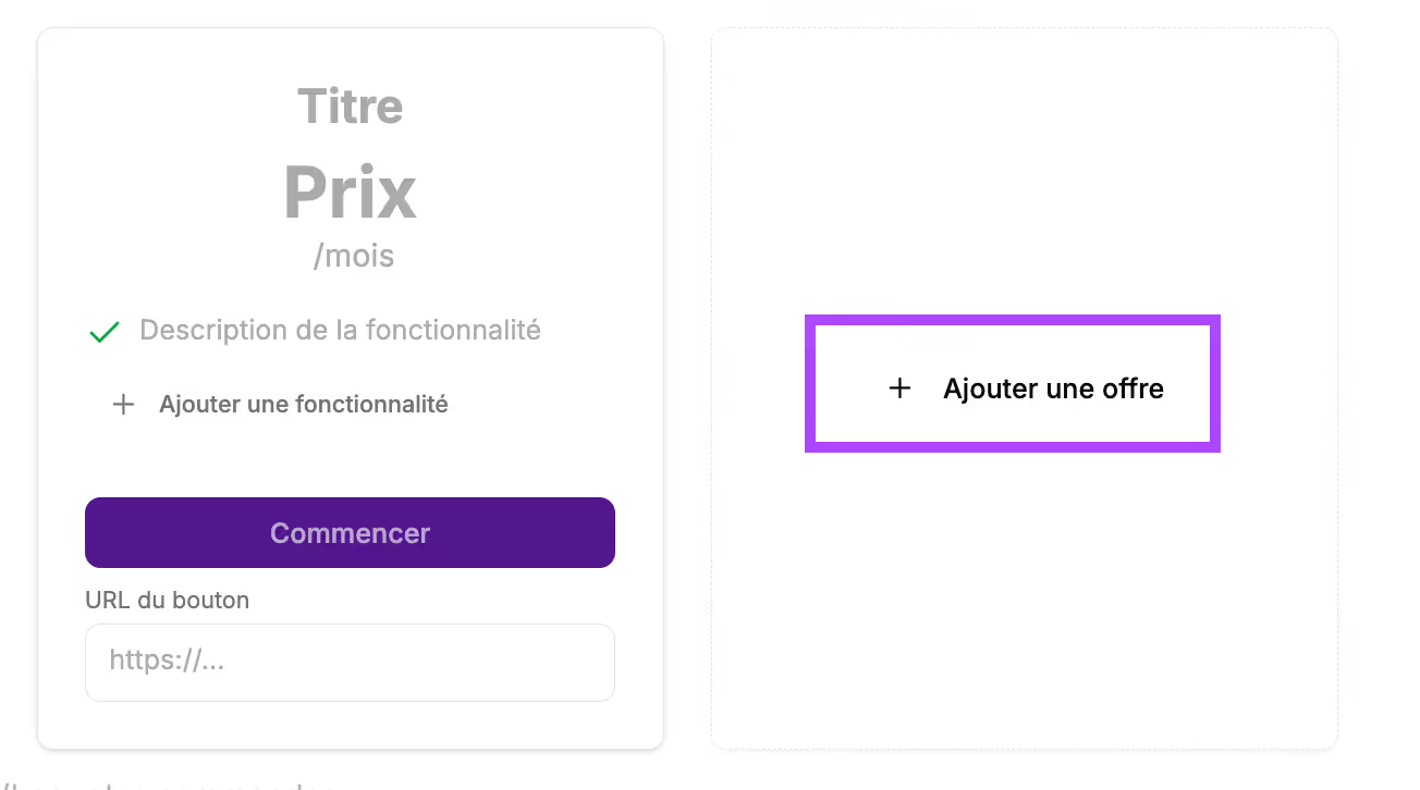
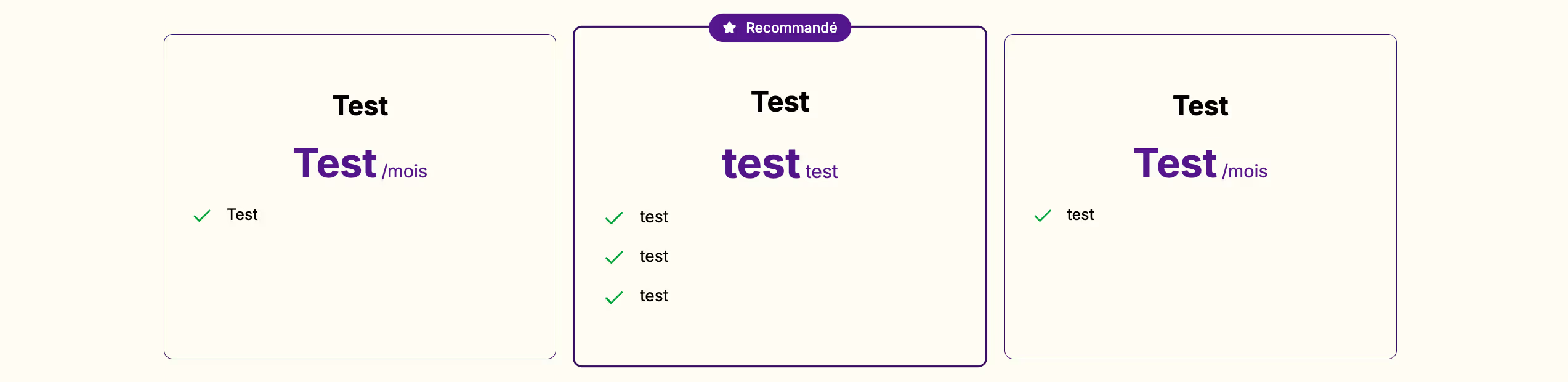
Pricing offers
Use case
- In the "Investment" section: comparison of several subscription offers and recommendation of a plan
- Packages with different service levels
Block construction
block It will appear in your section like this:
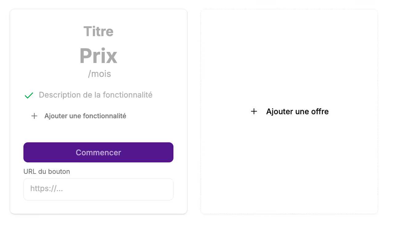
You can enter:
- In the Title field: Enter the name of the offer
- In the Price field: Enter the subscription amount (and currency)
- In the "/month" field: Indicate if it is a monthly or annual price
- In the feature descriptions: List the features included in this offer by clicking the "+ add a feature" button.
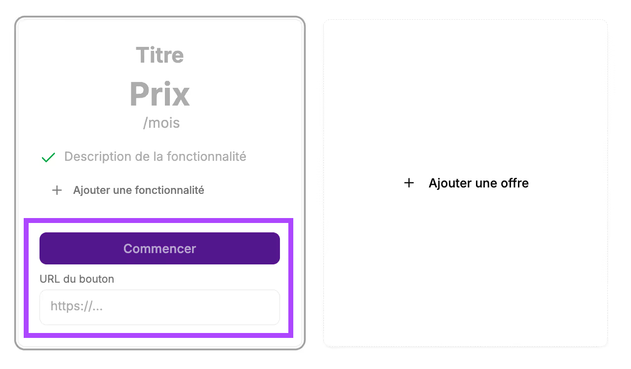
It is possible to add a button to call your prospect to action.
- In the "Get started" field: this is the text that will appear in the button
- Button URL: Paste the URL where you want to redirect your prospect.
You can add multiple price cards. Click "+ add an offer”.
Fill in the new offer.
When you add a second offer, you have the option to highlight one offer by recommending it. Click the Toggle button.
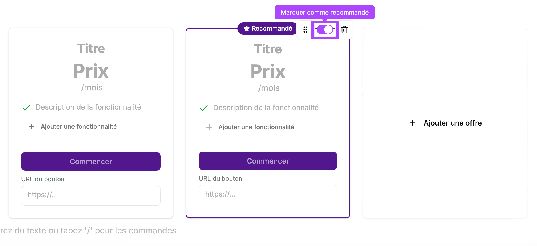
Cuevr manages the layout automatically. You can put up to 3 price cards on the same line.
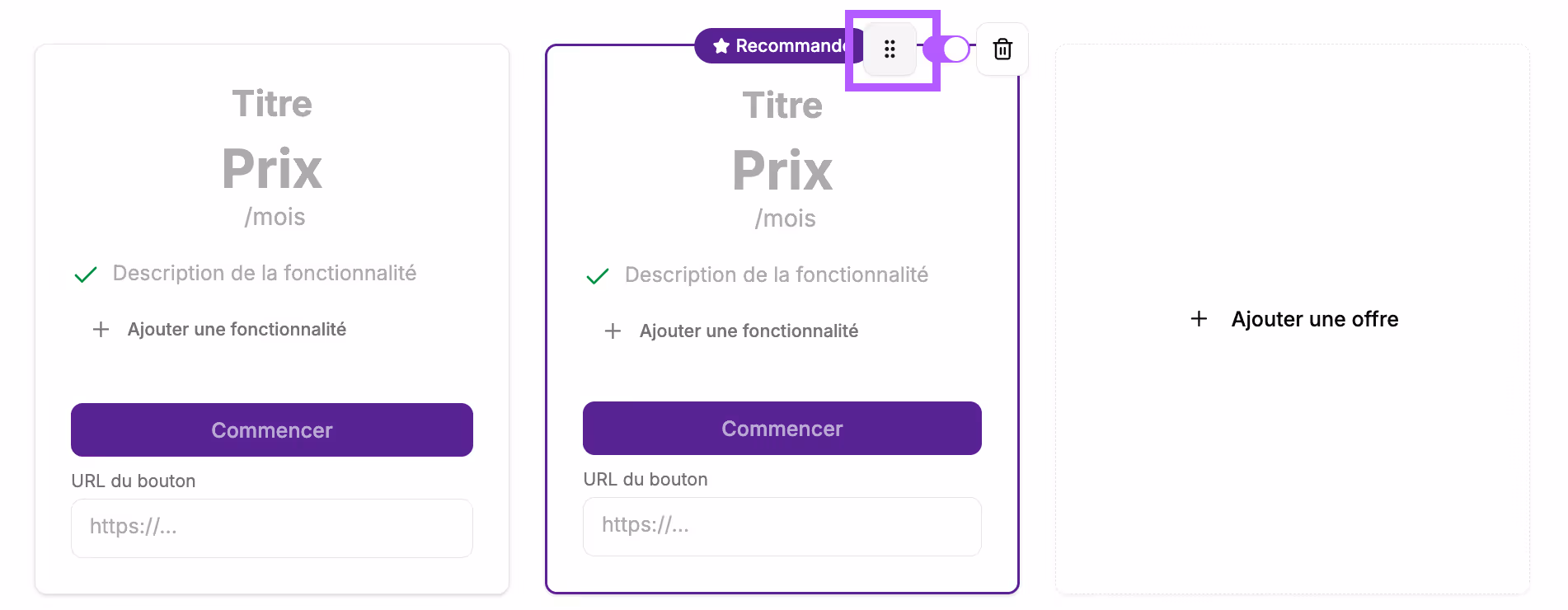
You can change the display order of the cards by clicking the 6 dots and dragging the card to the desired location.
Block preview
In the final proposal, this block will appear like this:
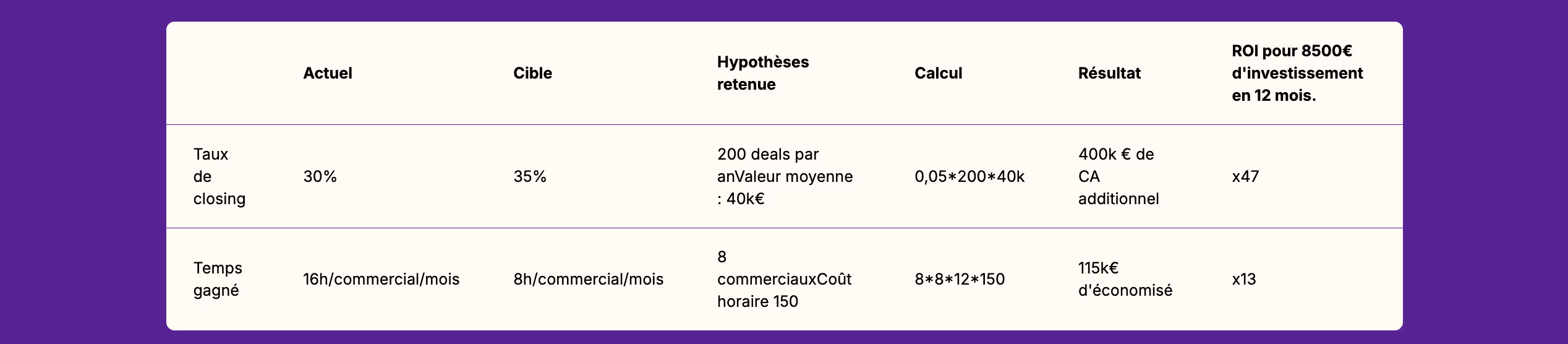
Table
Use case
- Comparison of solutions/offers
- Detailed pricing grid
- Matrix of deliverables
- Details of calculations in the "ROI" section
Block construction
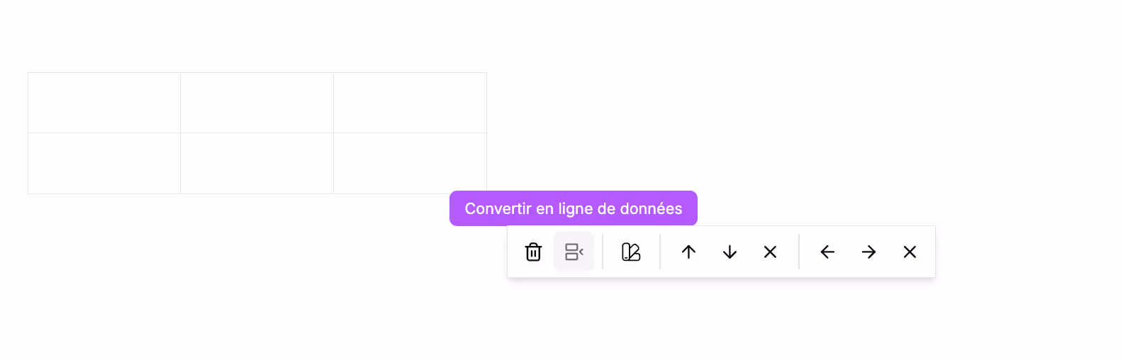
It will appear in your section like this:
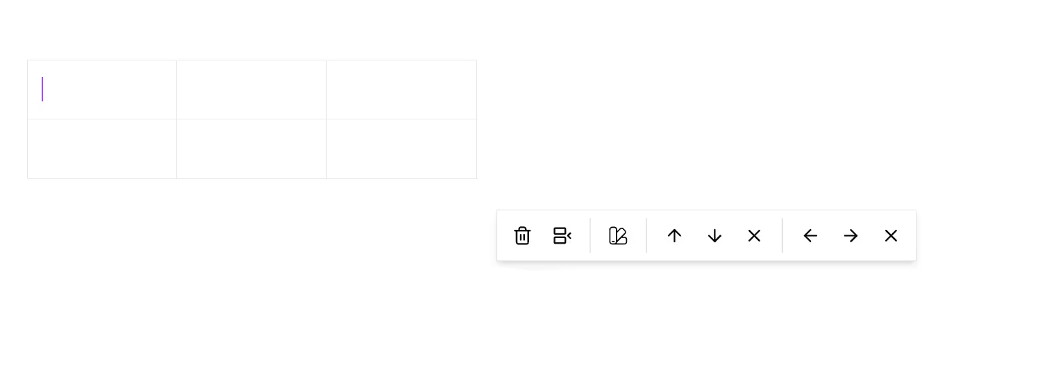
From the command bar, you can manage the table options: add a header row, choose the cell background, add/remove rows and columns.
By hovering over the icons, a tooltip appears to show you the corresponding option.
Block preview
In the final proposal, this block will appear like this:
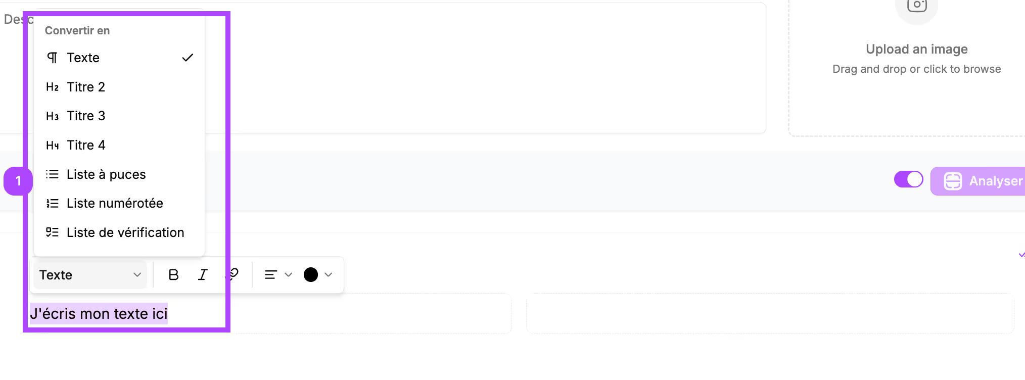
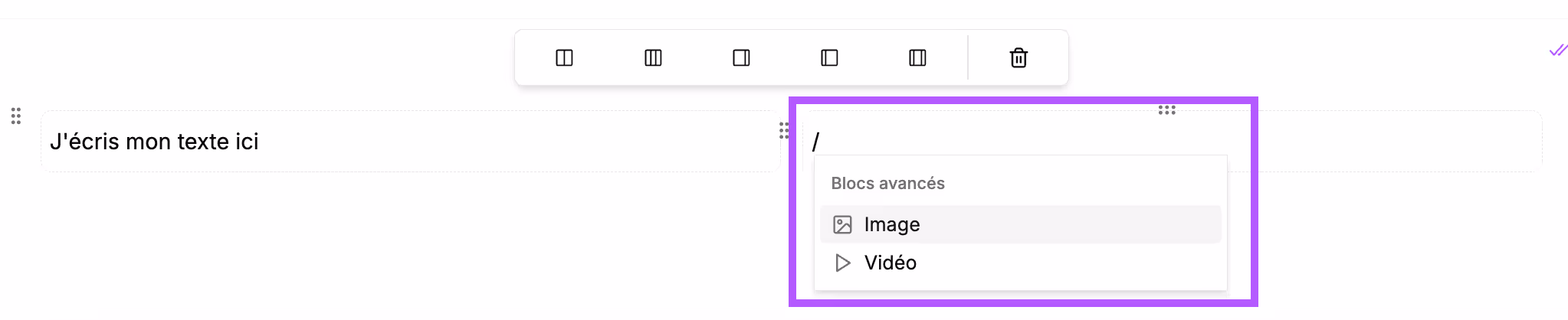
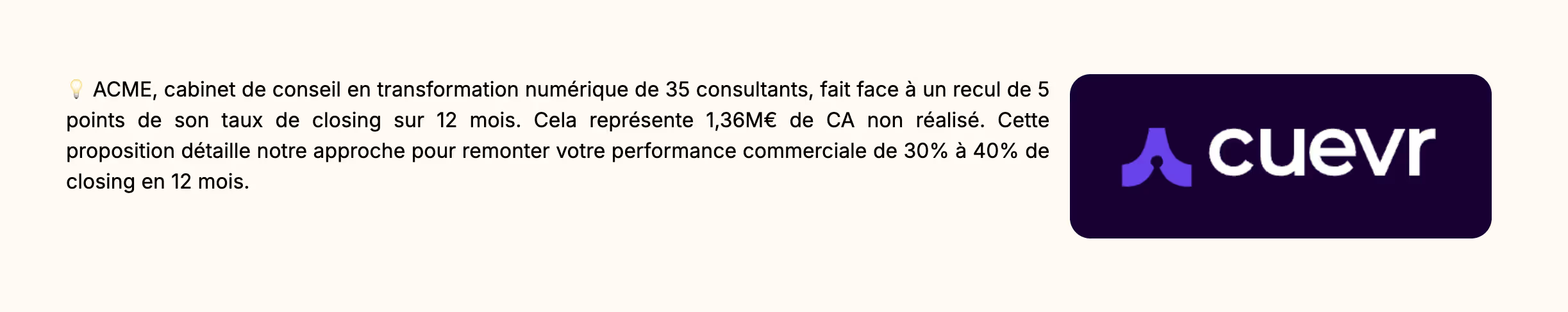
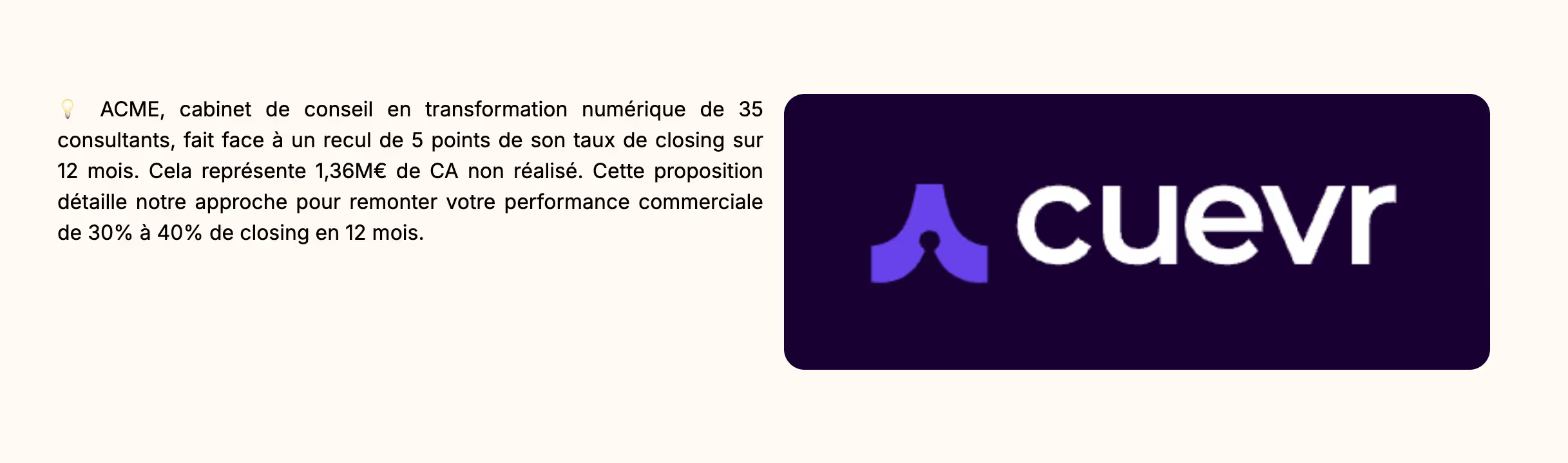
Image
Use case
- Illustrations of concepts
- Product screenshots
- Explanatory diagrams
- Visuals of past achievements
- Image to break up content and reinforce your brand image
Block construction
It will appear in your section like this:
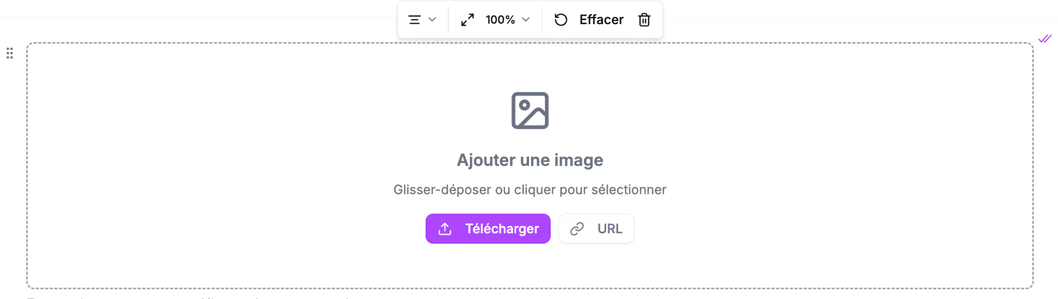
Téléchargez votre image ou collez l’URL de l’image que vous souhaitez inclure dans votre proposition.
Upload your image or paste the URL of the image you want to include in your proposal. You can choose the width the image will take up in your proposal. The image width can be:
- 100%: full width
- 75%: the image will take up 3/4 of the screen width
- 50%: the image will take up half the width
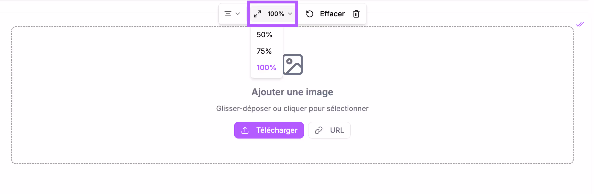
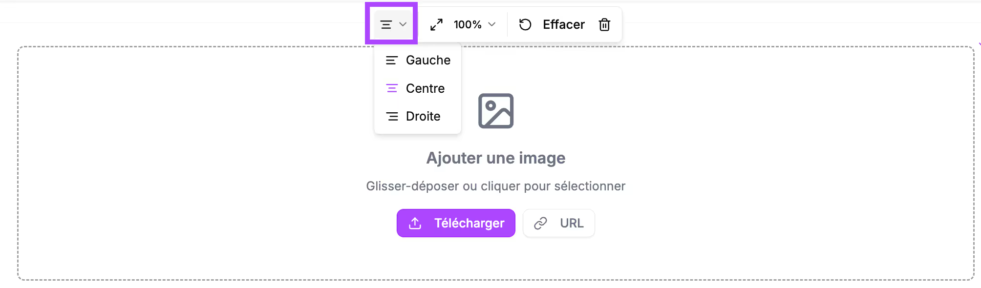
You can also choose the image's layout on the screen: centered, left-aligned, or right-aligned.
If you want to change the image, click "Clear" and upload the new image.
Block preview
In the final proposal, this block will appear like this:

Vidéo
Use case
- Product demonstration
- Team presentation
- Video case study
- User tutorial
Block construction
It will appear in your section like this
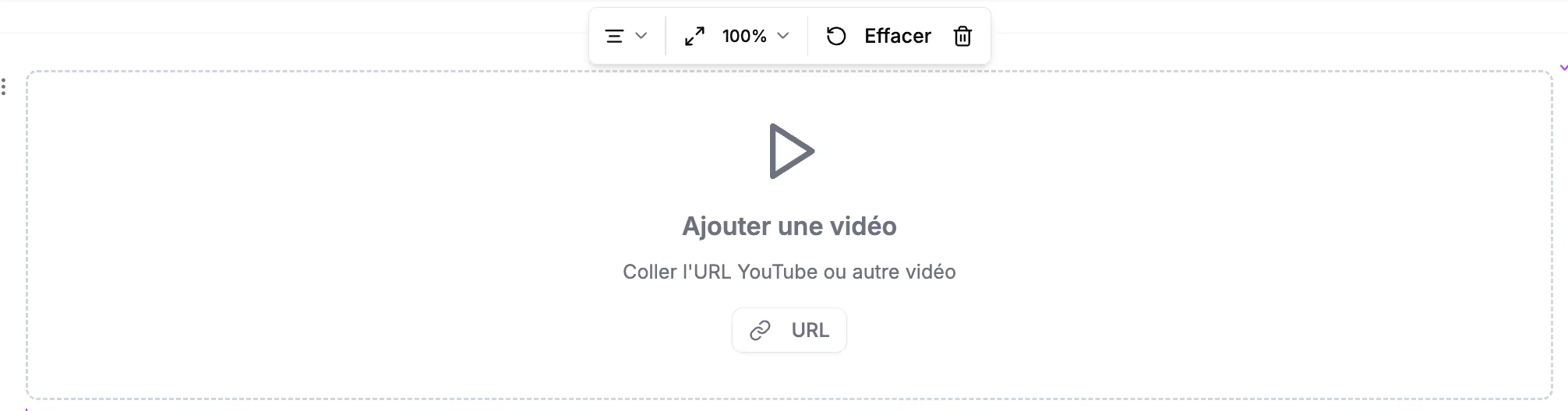
Paste the URL of the video you want to include in your proposal.
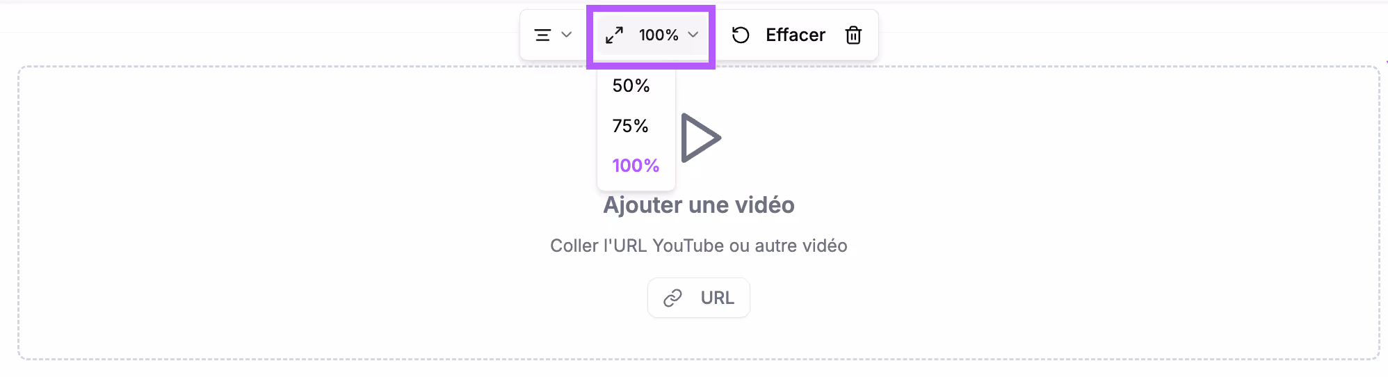
You can choose the width the video will take up in your proposal. The video width can be:
- 100%: full width
- 75%: the video will take up 3/4 of the screen width
- 50%: the video will take up half the width
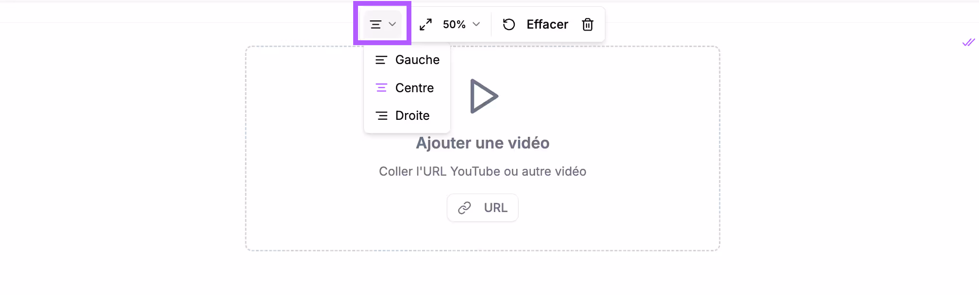
You can also choose the video's layout on the screen: centered, left-aligned, or right-aligned.
If you want to change the video, click "Clear" and paste the new video URL.
Block preview
In the final proposal, this block will appear like this:

Dialog boxes
Use case
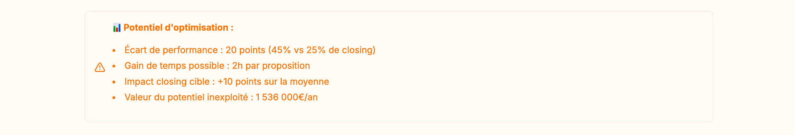
- Highlighting important information: business impact, financial cost, optimization potential
- Alerts on special conditions, payment terms
- Points of attention in the quote
- Reassurance messages
- In the "Executive summary" section to include a commitment phrase "our team is at your disposal for (facilitating action)" and add contact information.
- In the "Proof of expertise" section to highlight average statistics noted by clients
Block construction
It will appear in your section like this:
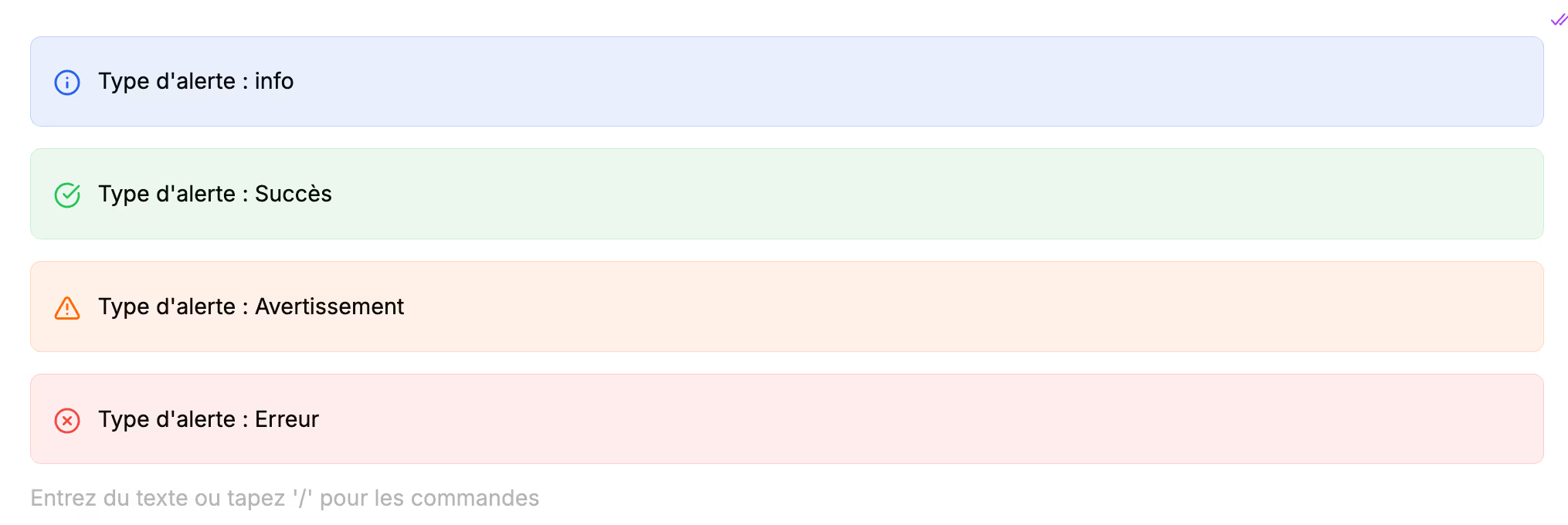
There are 4 types of dialog boxes:
- Info
- Success
- Warning
- Error
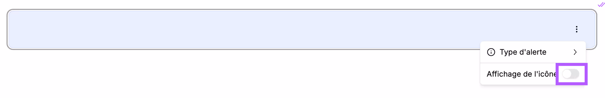
To change the alert type, click the 3 dots to the right of the dialog box and select the desired alert type.
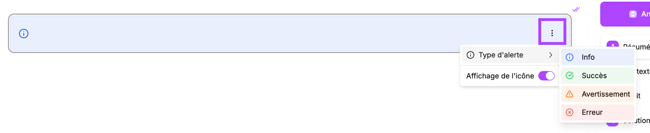
By default, an icon is displayed to the left of the dialog box. To remove it, click the 3 dots and click the toggle.
Block preview
In the final proposal, this block will appear like this:


Button
Use case
- Call-to-action for booking a meeting
- Link to demo/free trial
- Access to complementary resources
- Electronic signature of the proposal
Block construction
It will appear in your section like this:
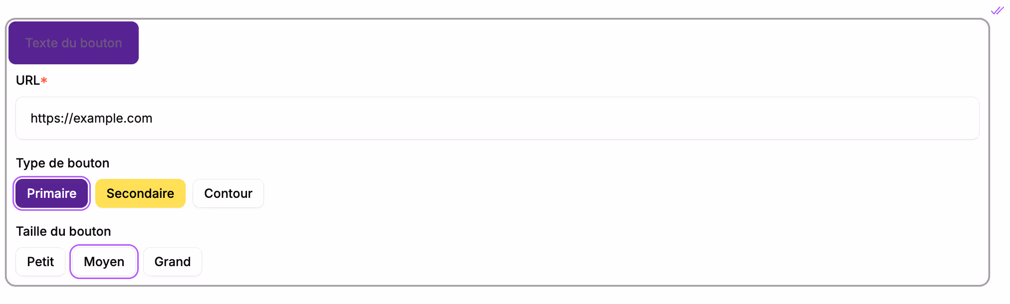
Enter the text you want to appear in the button and paste the URL where you want to redirect your prospect.
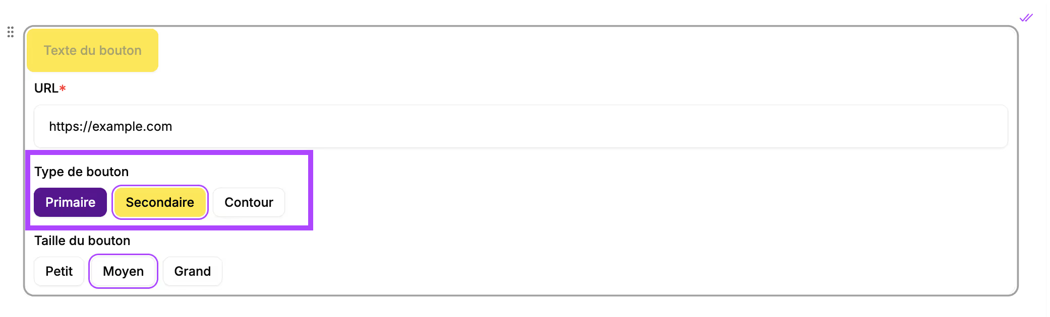
You can also choose formatting options for the button:
- Its color: your brand's primary color, secondary color, or a white button with an outline
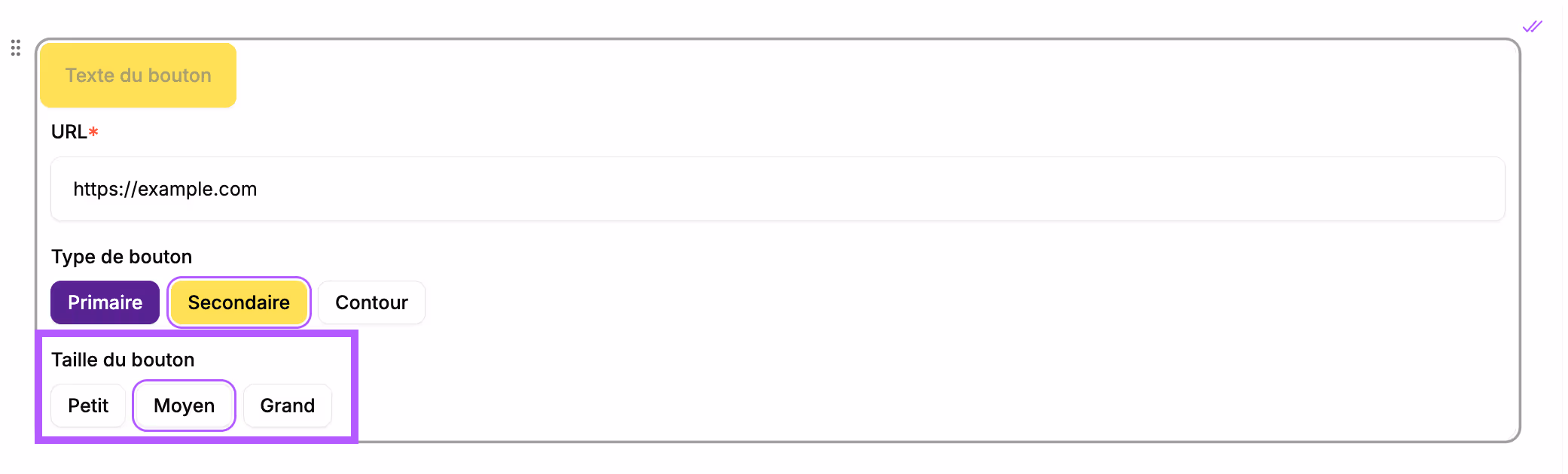
- Its size: 3 sizes are available
The button will be centered on the screen in the final proposal.
Block preview
In the final proposal, this block will appear like this:


Columns
Use case
- Comparison of two approaches (before/after)
- Text + image layout
- Presentation of alternatives
Block construction
It will appear in your section like this:
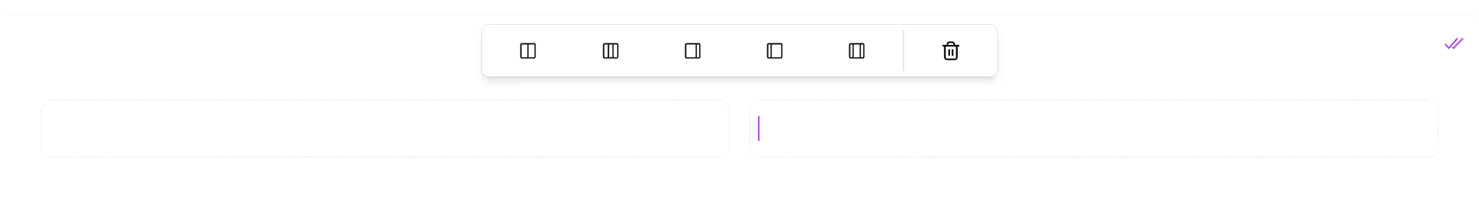
5 layouts are possible:
- 2 equal columns (50/50)
- 3 equal columns (1/3 each)
- 2 unequal columns (75/25)
- 2 unequal columns (25/75)
- 3 unequal columns (25/50/25)
The columns can contain text, titles, images, and videos.
→ Type the text and format by clicking on it.
→ Insert images or videos by typing / and selecting the desired block
Block preview
In the final proposal, this block will appear like this :
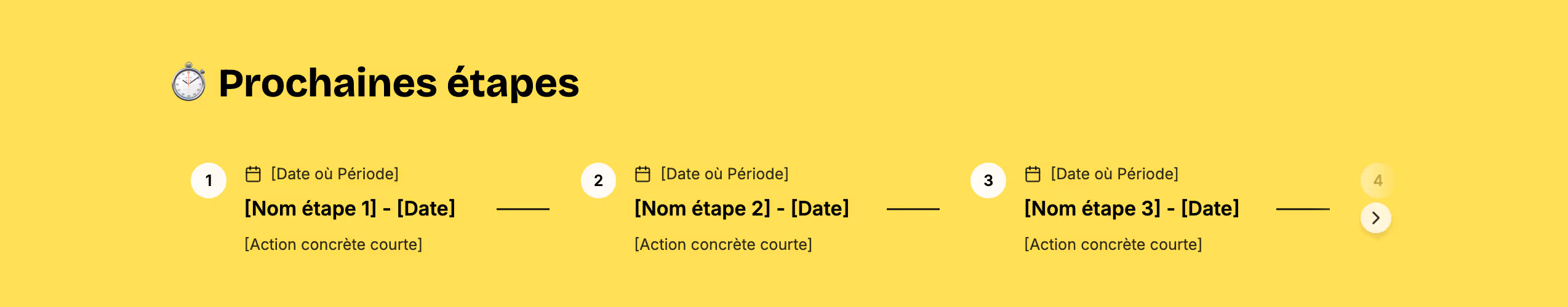
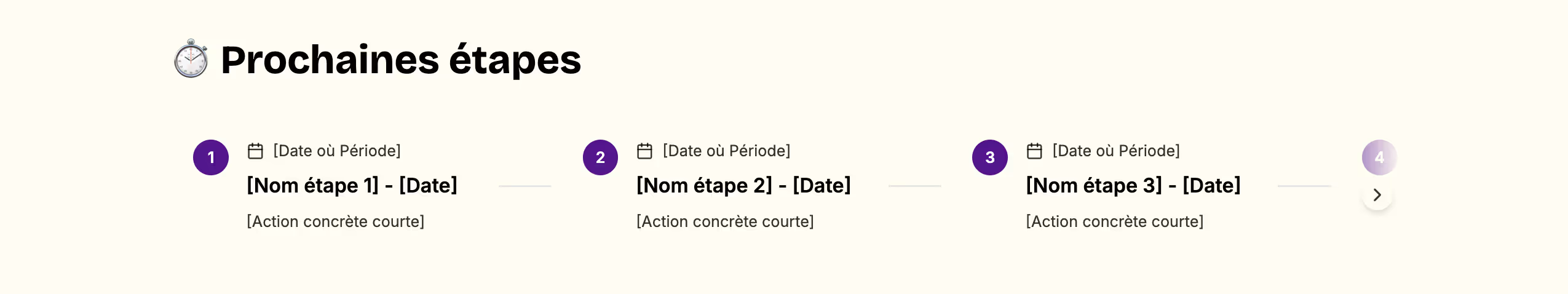
Timeline
Use case
- In the "Methodology" section to explain the project steps
- Provisional intervention schedule
- Flow of a process
- Company history
- In the "Executive summary" to describe the next steps
Block construction
It will appear in your section like this:
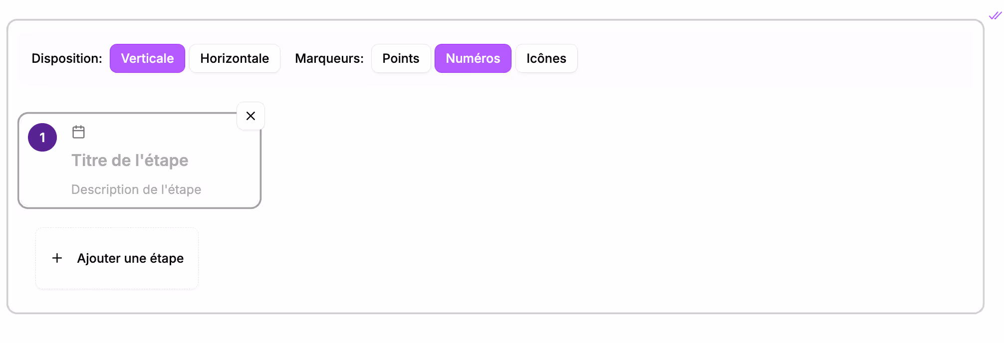
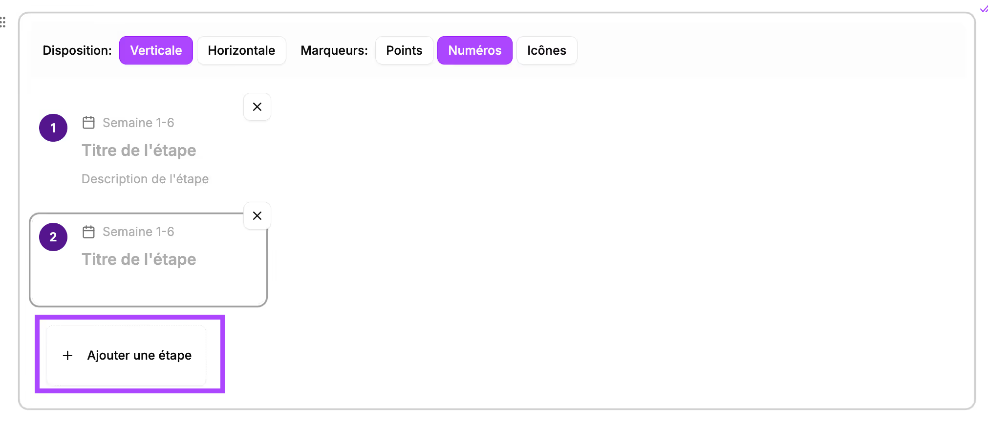
Each step appears in a box. You can indicate for each step:
- Next to the calendar icon: the timing of the step
- The title of the step
- A description of the step
Add steps by clicking the "+ Add a step" button
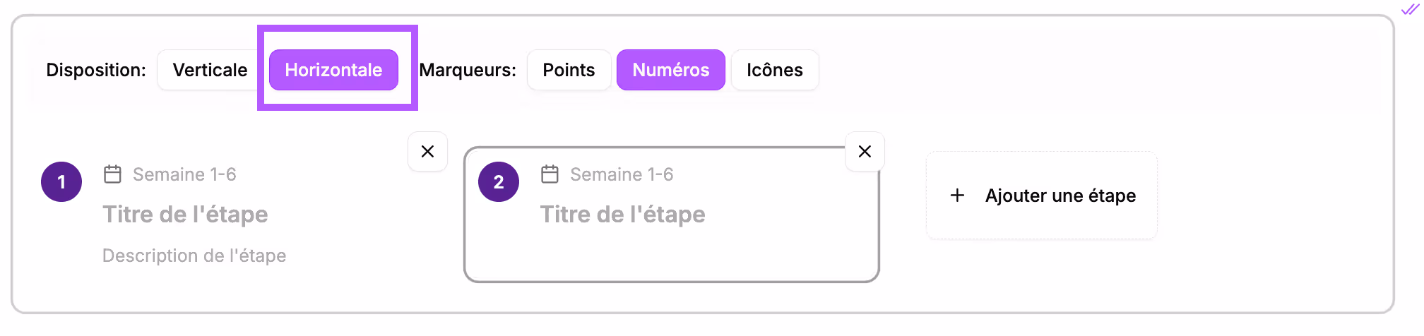
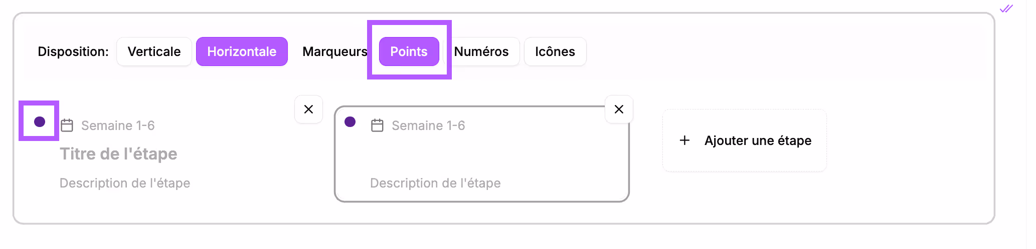
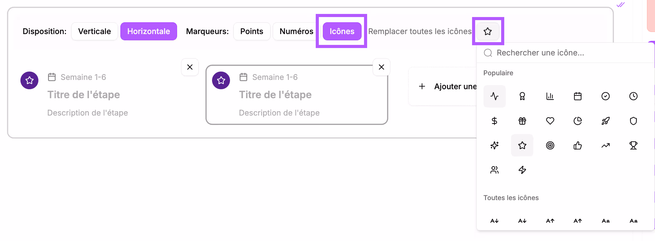
You can change the formatting of this block.
→ By aligning the cards horizontally instead of vertically:
→ You can change the marker. By default, they are numbers, but you can opt for dots or icons. To do this, click the corresponding buttons.
Block preview
In the final proposal, this block will appear like this:
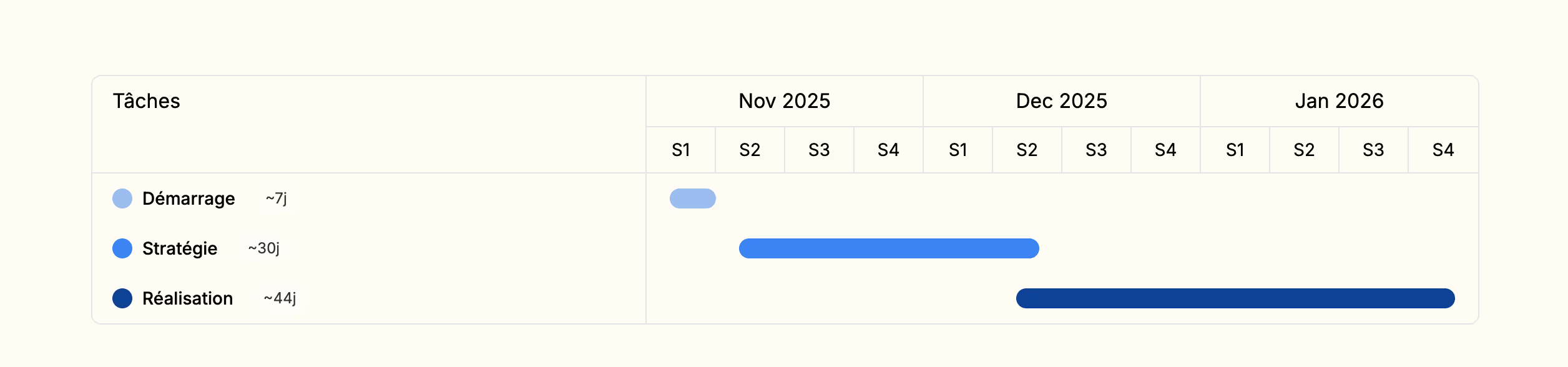
Gantt chart
Use case
- In the "Methodology" section: detailed project calendar
- Planning of deliverables
- Visualization of important milestones
- Coordination of different phases
Block construction
It will appear in your section like this:
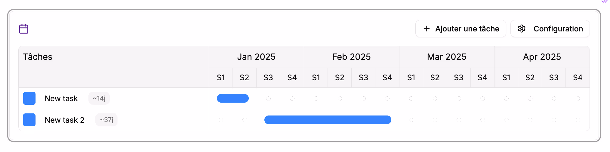
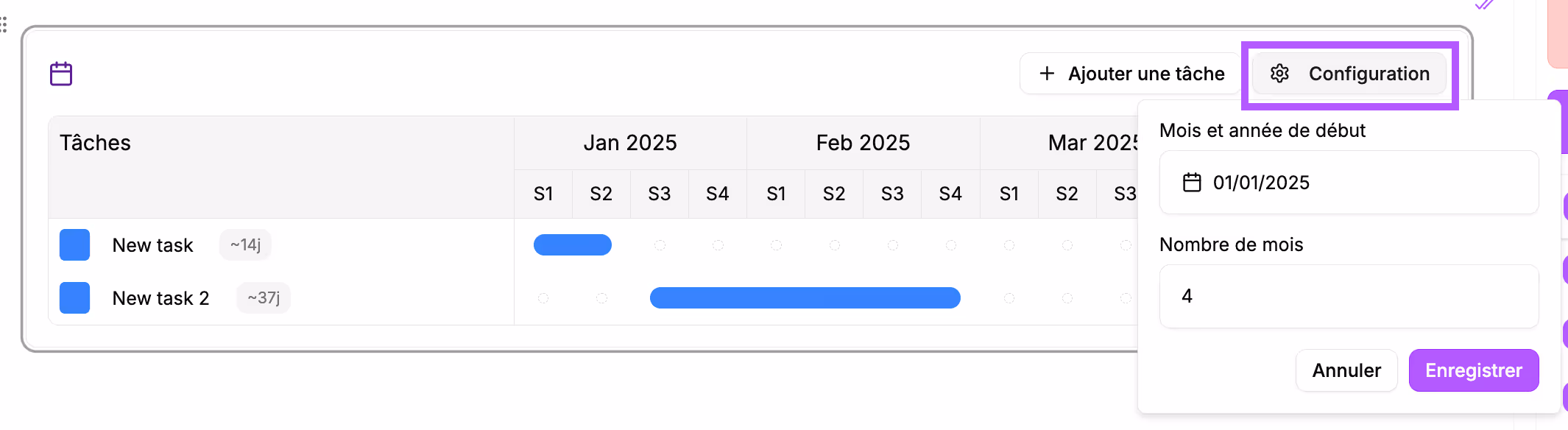
Start by configuring the Gantt chart to choose the start month of your timeline and the required number of months. To do this, click the "Configuration" button.
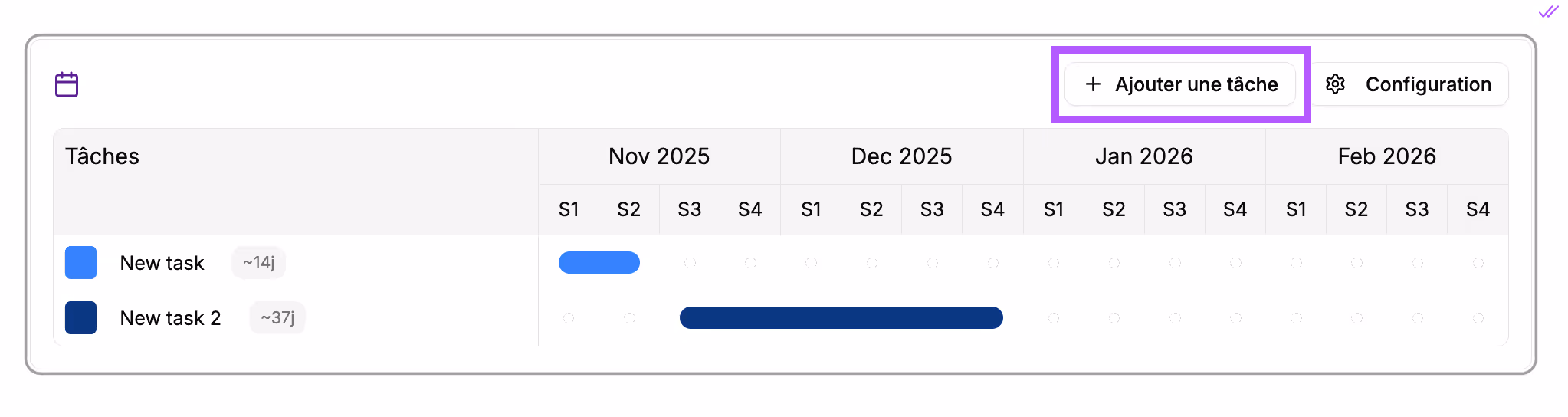
2 tasks appear by default; rename them by clicking on them.
Click the "+ Add a task" button to add as many rows as necessary.
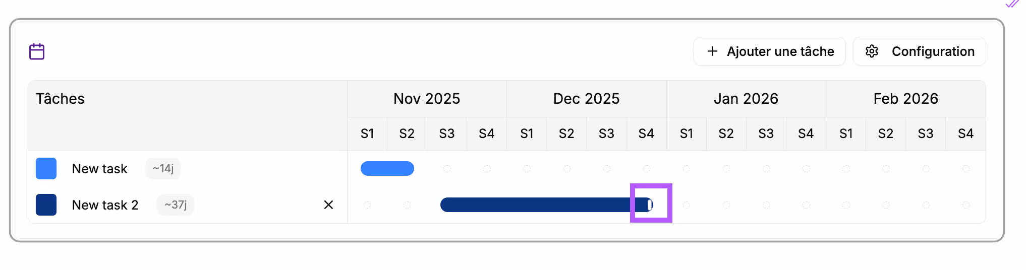
Adjust the duration of the tasks. When you place your cursor on the edge of a bar, a small handle appears; click and drag it to lengthen or shorten the task.
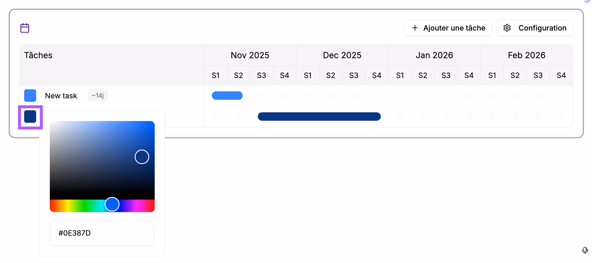
You can change the color of the bar by clicking the colored square to the left of the task title.
Block preview
In the final proposal, this block will appear like this:
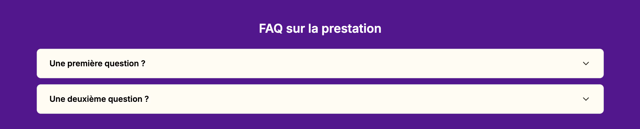
Questions & Answers
Use case
- FAQ at the end of the proposal
- Answers to common objections
- Clarification of conditions
- Anticipating prospect questions
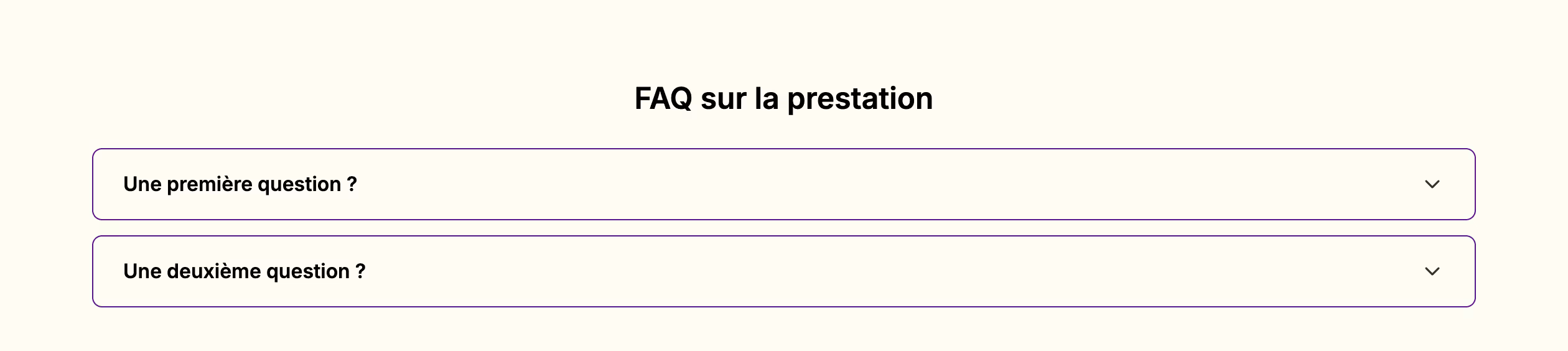
Block construction
It will appear in your section like this:
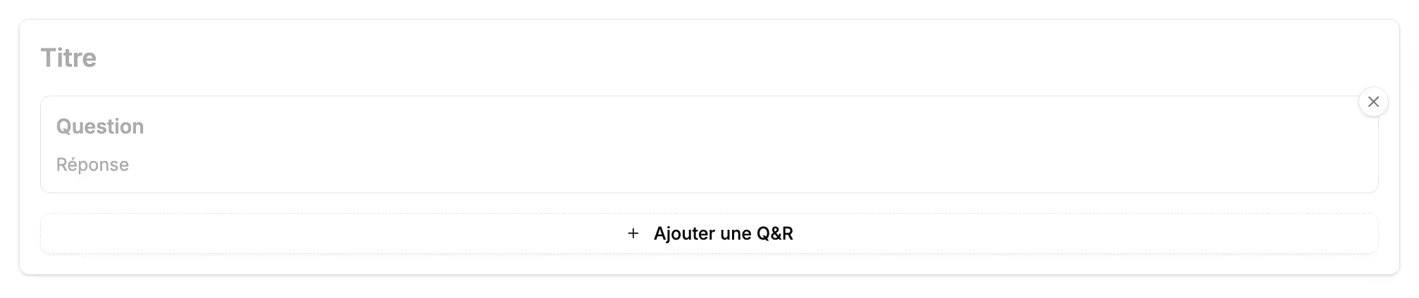
- Enter the title of your FAQ
- Write the question and the answer in the dedicated fields
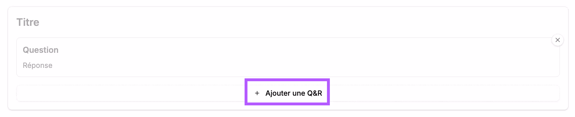
- Click the button to add a new question
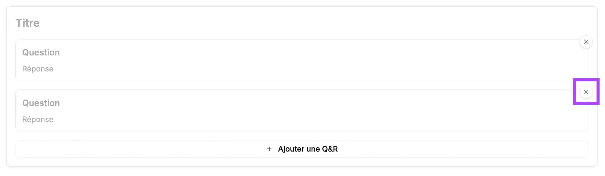
If you want to delete a question, click the cross (x) to the right of the question to be deleted.
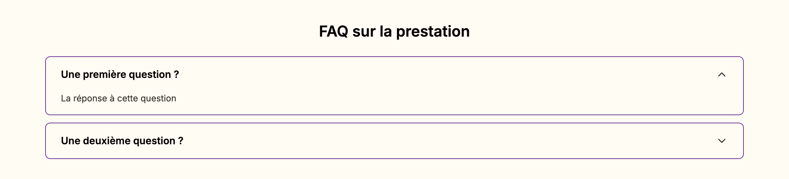
Block preview
In the final proposal, this block will appear like this:
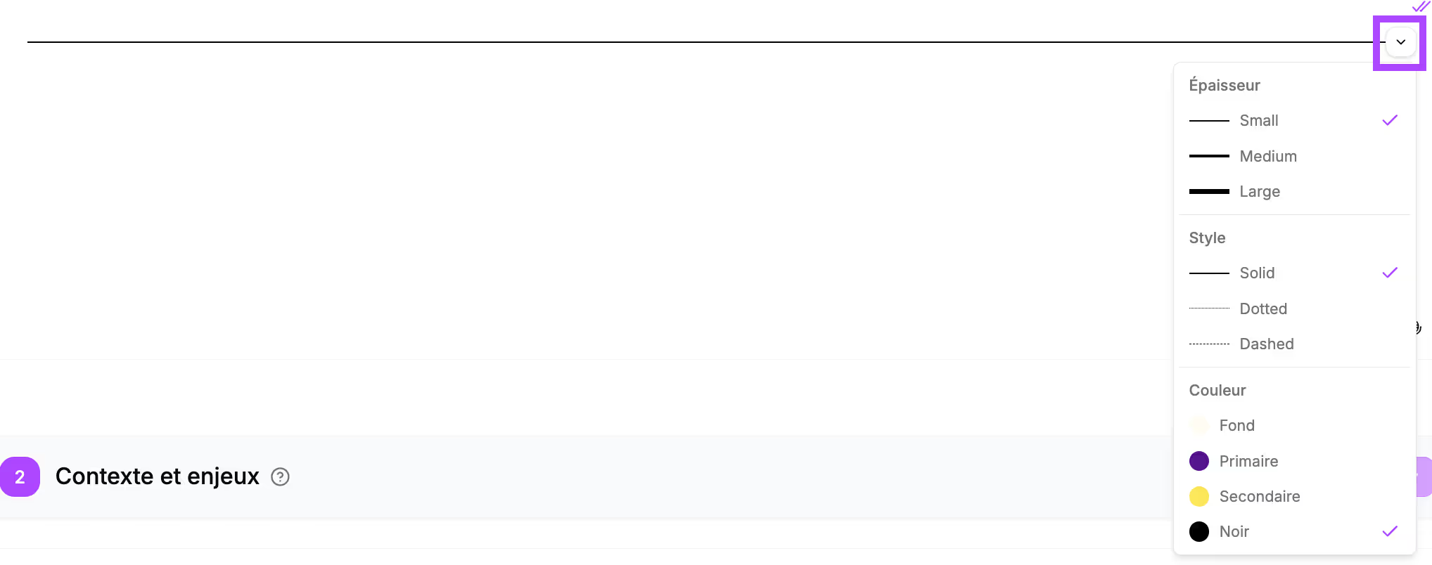
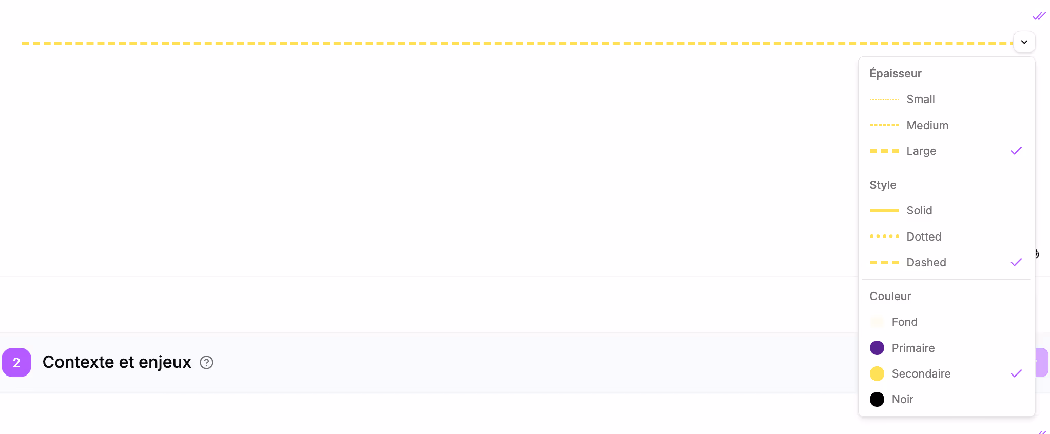
Separator
Use case
- Transition between sections: you can add a separator under the section title to highlight the change of topic and make it easier for your prospect to read
- Visual structuring of the document to separate elements within the same section
Block construction
It will appear in your section like this:

Several formatting options are available to customize your separators:
- Thickness: more or less thick
- Style: solid, dotted, dashed
- Color: gray, black, or your brand colors
Block preview
In the final proposal, this block will appear like this:
Logo wall
Use case
- In the "Proof of expertise" section to highlight client references
- Highlight technology partners
- Highlight your Certifications and labels
Block construction
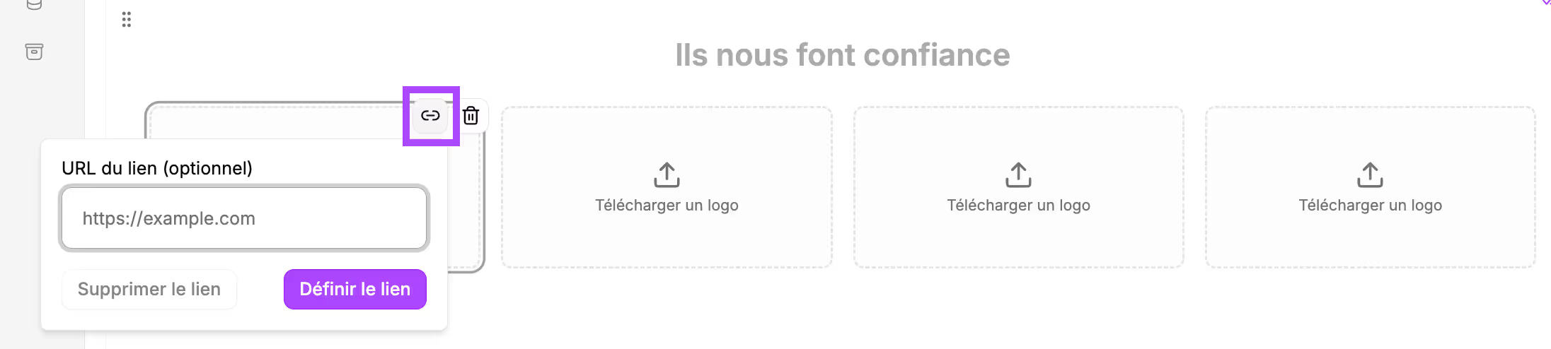
It will appear in your section like this:
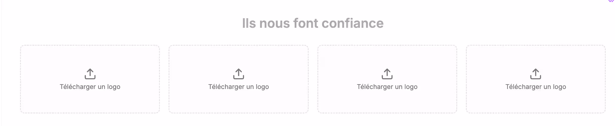
Fill in the title of the block then add the logos.
For each logo, you have the option to add links.
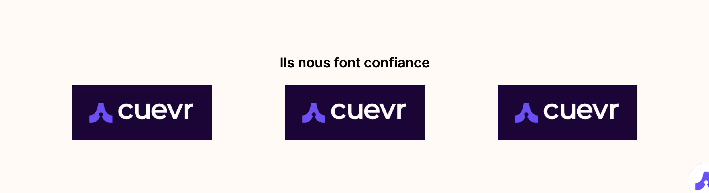
Block preview
In the final proposal, this block will appear like this:
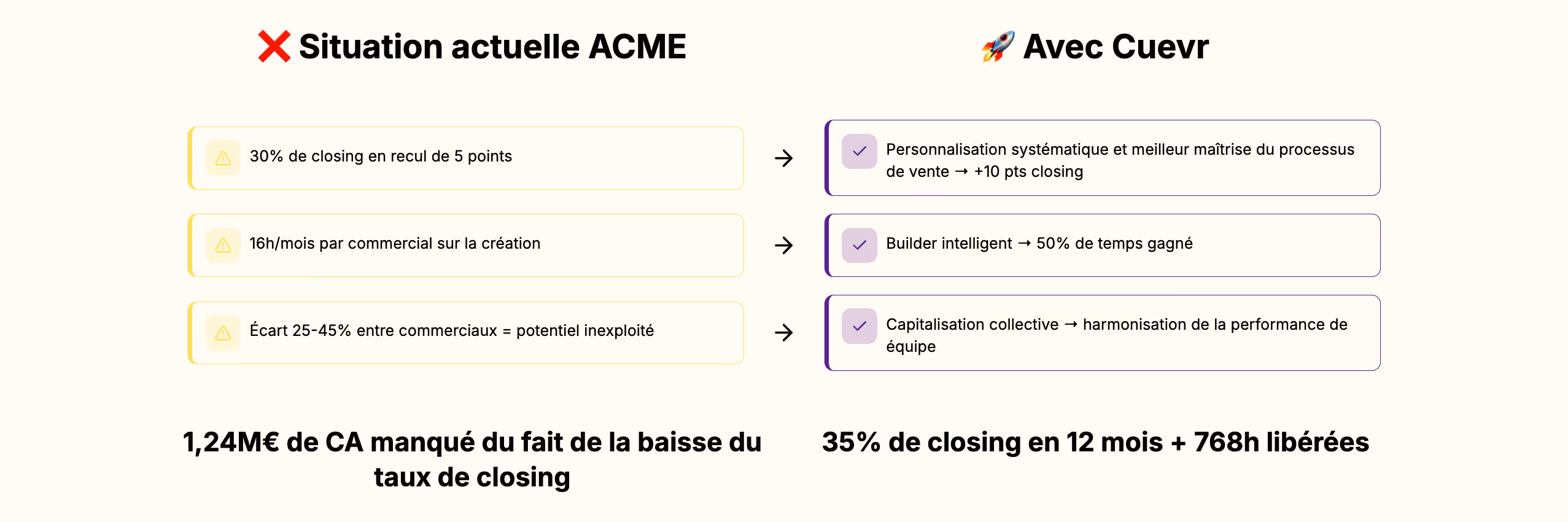
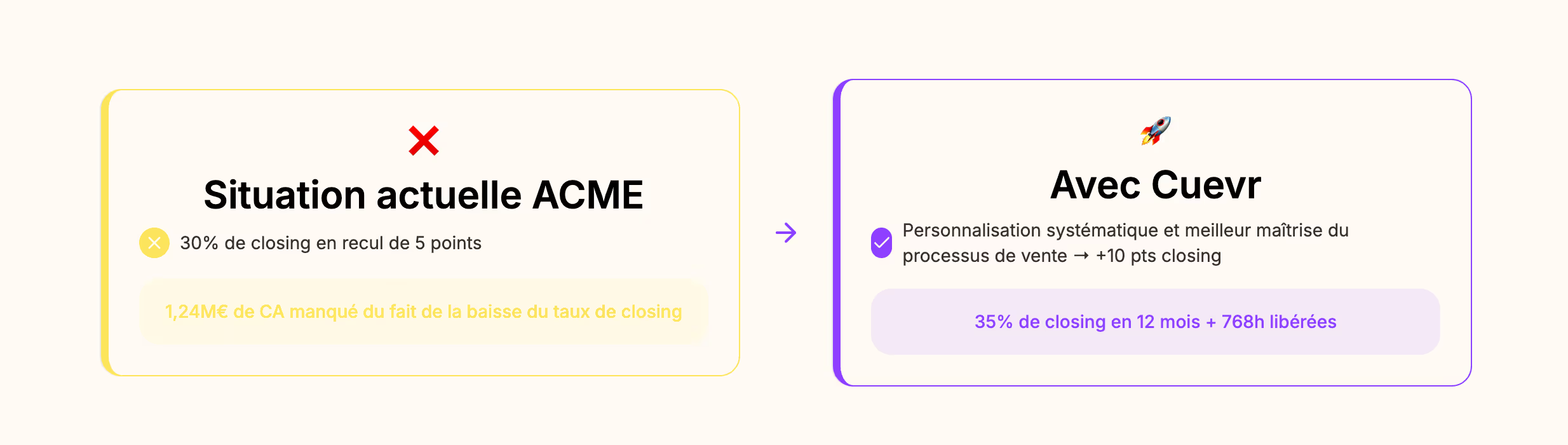
Before/After Comparisons
Use case
- In the "Context and challenges" section: highlighting the problem
- Visualization of the benefits of the solution you provide
- Transformation brought by your offer
Block construction
It will appear in your section like this:
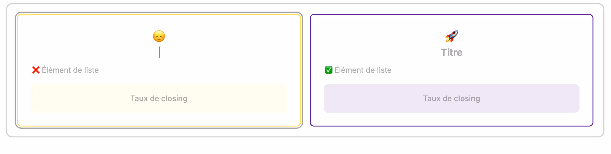
Highlight the negative points of the current situation using the title, the list elements (you can add more by pressing enter), and the colored box.
Do the same with the situation achievable thanks to your proposal.
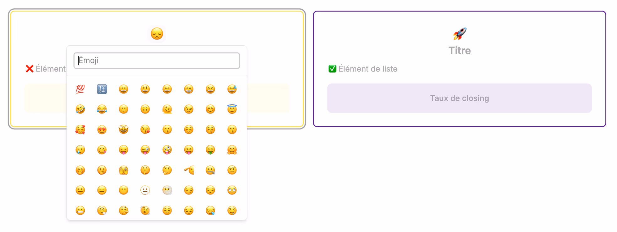
You can change the emojis by clicking on them.
Block preview
In the final proposal, this block will appear like this:
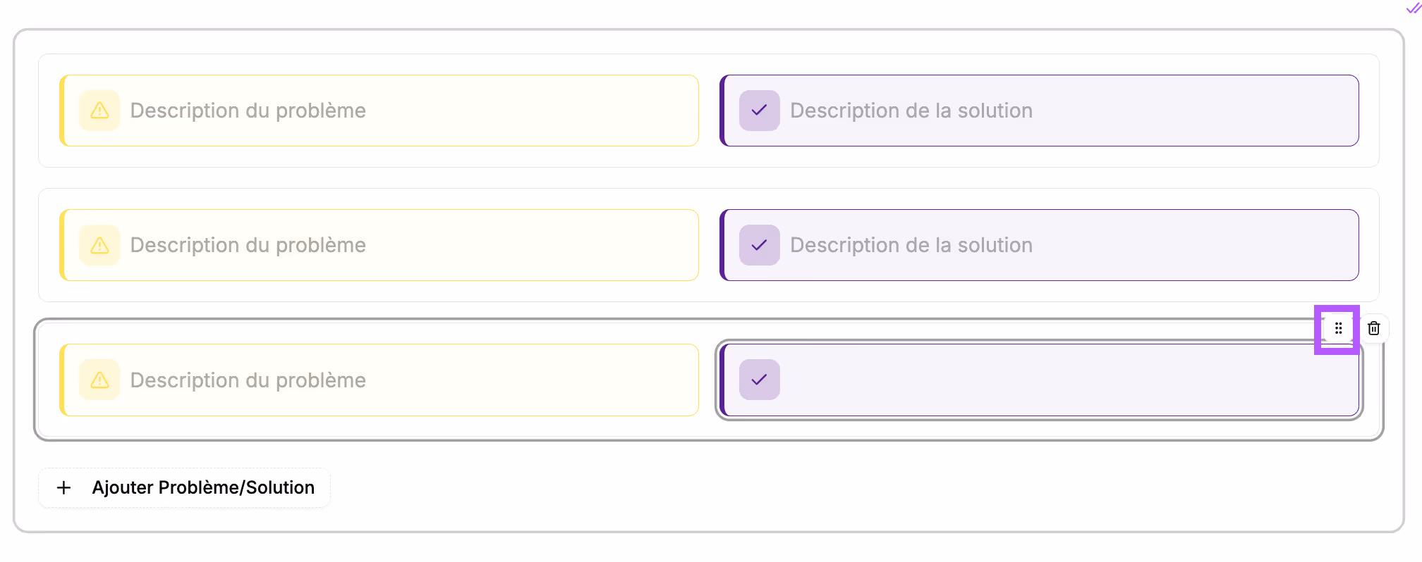
Problems/Solutions
Use case
- In the "Executive Summary" section to highlight the prospect's current situation and the possible situation with your support
- In the "Solution" section: respond point by point to the challenges raised by the prospect and demonstrate understanding of their needs
Block construction
It will appear in your section like this:
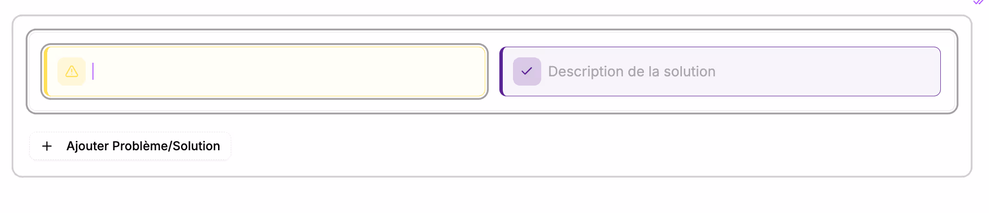
Fill in the problem and the solution provided by your proposal.
You can add a new problem/solution box using the button provided for this purpose.
You can click the 6 dots to change the display order of the problems.
Block preview
In the final proposal, this block will appear like this: